Showing posts with label Illustrator. Show all posts

Saturday, 22 February 2014

Garment Flats

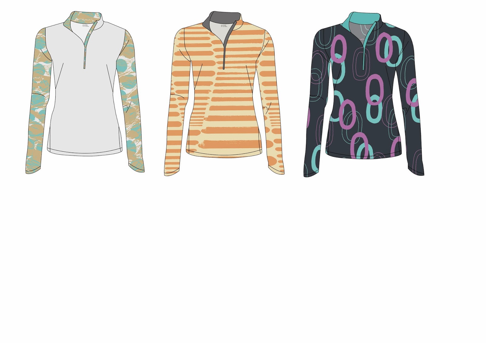
I haven't drawn technical flats since the beginning of first year so it was fun to revisit this. I'm not happy with the hand drawn ones so have taken them into Illustrator to give them an update.


 Alex suggested I add the 'foil' label to my flats, and to give them a more realistic feel by changing the opacity at the back, which I hadn't thought about but they look 100% times better now.
 I experimented with different types of garments, vests, leggings and jumpers. I plan to also look at swimwear too. I like the different placements that I can use with the jumper and feel that the flats look quite professional.


Saturday, 25 January 2014

Live Trace with Adobe Illustrator

On thursday I went to one of Alex's Digital Workshops as I feel it is important to learn as many skills as possible throughout my time on this course (and I said I would do so in my brief). Especially with my project at the moment being very intensively digital based. I feel quite confident on Photoshop however Illustrator is my weakness so this is my main reason for attending.


Here is a screen shot of part of the process. The effect it has on photographs rather than hand drawn imagery really intrigues me, I think it looks quite similar to the effect I was trying to create through my Intentions unit.

Tuesday, 29 October 2013

Developing Designs

After creating my mood boards I began to scan in my current drawings onto my computer. When creating prints I prefer to work digitally so went straight into Photoshop with my drawings. I had also created some backgrounds as I did not want to have just a flat plain background, something I want to highlight within this project is texture within the design.

Firstly I began with making my drawings into brush tools on Photoshop. I also took some of my designs into Illustrator to make them more graphic as some of the pencil lines were quite sketchy which was not the aesthetic that I wanted with those particular designs.


Currently I am just in the experimentation phase of the project. Both of these designs were to see how the colours I had chosen were going to work together and the proportions of these colours. My favourite between the two is the one on the right. It is not perfect, and I have tried to stay away from repeated prints however what I do like about the print is that even though it is a sketch of scaffolding links, it looks like barbed wire where it has been put together and looks rather abstract.

After looking over these two designs and analysing them I have came to the conclusion that I would like to steer towards less repetitive prints with a low opacity within the brush tools. I would also like to explore placement prints.


Monday, 21 October 2013

Mood Boards

I have been trying to create some inspiration for myself using the images that I have collected over the past week. I have put these images into a few mood/ colour boards to help me decide what colours I want to use throughout this project and what style of design and customer I am aiming towards.


Between the two mood/ colour boards I think the first one is my favourite and demonstrates the style of designs I want to create. The colours within the second board are a bit all over the place on reflection. I really like the combination of the orange and green however I feel that the rose and pink do not fit in. I still want to include some more muted tones of grey, adding gradients into the backgrounds possibly.

My next step throughout the project will be to scan all of my drawings into Photoshop and Illustrator and start to play around with different brushes and colour palettes to try figure out a much more defined path to follow. This is the part of the process I love, so hopefully I will have a larger quantity of work very soon. However with this in mind, I will still carry on drawing to improve my drawing skills and to keep up with the momentum of inspiration.

Monday, 10 December 2012

Evaluation of Origins Unit

Throughout this project, drawing was the key aspect. Although during the first two weeks or so of the project I was feeling really uninspired and unmotivated, I did not feel as though this was the right world for me and that I was slightly out of my depth. This lead to my work becoming quite slowly produced and if I had gotten into uni more on my days off I feel that maybe this could have changed, or possibly I just had not done enough research. I will not let this be a factor within this next project. However from following out a number of drawings from different galleries and day to day objects I was able to come up with the concept of 'Multiples'. This concept immediately inspired me and I began to draw a lot, experimentation was key within this project as we had to eventually design a print that would then go towards a collection.


My inspirations firstly came from the mood boards that we were asked to create. We had to carry out this activity twice as we had misunderstood the brief the first time around. Personally I was glad that we had to do this again as I was not inspired at all my the first mood board we had created relating to 'Opposites Mixed Up'. The drawings which I produced throughout this week were quite expressive, which is exactly the type of drawing that I wanted to produce. Looking back I wish I had created a lot more drawings that were more relevant to the course and the brief over all. The reason that I feel this is that some of my drawings were not relevant and were not used, I could not develop them further, which I should be able to do with each and every one of my drawings.


From the above images it is clear to see how my illustrations have developed from the 'Fashion Illustration for Dummies' tutorial to my final piece. Personally I am rather proud about how these have developed, as I was going to just settle for the first drawing but this was not an option, I knew that my first drawing was not good enough so I sat for hours trying to draw something I was happy with. Finally I produced the second image which I felt just clicked. The digital aspect of TD4F has really inspired and motivated me within this project as I find Photoshop and Illustrator extremely user friendly and some what easy to use and feel that this was definitely one of my strong points throughout the project. Although I already had experience using Photoshop, this was my first time using Illustrator, I was also able to learn lots of new things in Photoshop which allowed me to produce work faster and I am really glad that I had attended the CAD workshops as they are so useful. This definitely allowed me to develop and explore my skills within this area.


These skills have allowed me to produce this final design board, which is one of 6 final boards that I eventually created for the end of the project. I feel that my fashion flats could be more technical as at the moment they look more free hand, I will work on this when I next revisit this world, I feel that more time using illustrator could also give me an advantage within this area. The scale of the garments could also do with being slightly reduced. The one this that I am certain worked out well in this board is the garment on the illustrations. They are graphic, bold and contemporary which is fundamentally what I was aiming to do. I feel that my independent study time would be better used in the studio space rather than in my flat. Although I have enjoyed working at my own pace and with my own surroundings, it is essential that I use the space that has been provided in order to allow me to become inspired and to ask for guidance when and if I need to do so.

Overall I feel that this TD4F project has been successful which also reflects in the grade that I was given, I have enjoyed it but feel that there are still things that I need to improve upon in the future. Points that I would like to improve upon are my allocation of time and space, spend more time surrounded by other practitioners in the studio space. Visit more galleries and exhibitions to absorb inspiration and widen my knowledge of media. Finally to act upon my ideas immediately and to produce work not only faster but that is also more relevant in order to not get stuck and to power through.


Monday, 12 November 2012

Fashion Illustrations

After doing drawing after drawing after drawing I have finally done some fashion illustrations that I am happy with. At first my face were horrible but I found a way round it and feel like the final outcome has really worked and that my illustrations suite my designs. Things that could have been done better are the eyes on the faces on the illustrations, also I need to work on drawing hands and feet. I can get the basic outlines right just on the details which is a bit of a let down for me.

I had a tutorial this morning and showed my tutor my illustrations that were different to these examples here.
I wasn't really happy with my work after the tutorial and this gave me motivation to improve my work and to really put all my effort into my designs so I have spent my full day drawing and redrawing my illustrations and redesigning my prints.


Final 6 Designs


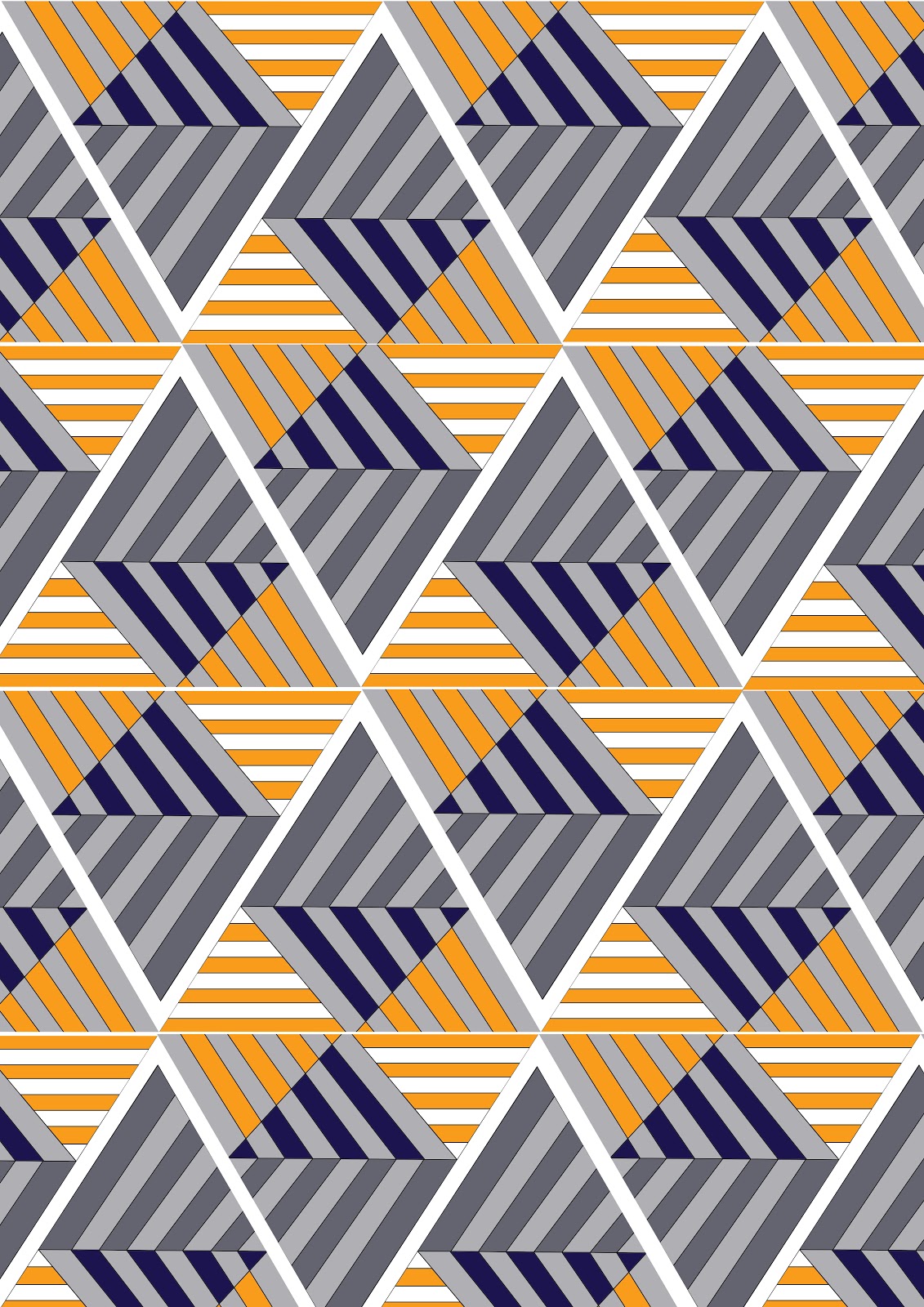
since developing my colour palette I have been able to progress with my designs and develop them using this chosen colour palette. I feel that the orange and blue combination give the prints a modern twist as well as the bold geometric shapes. I feel that my favourite design is the second one down as its interesting and bold, I feel that I would wear it myself. The design which I feel has not worked the best is the design with the hexagons, although it is in keeping with my theme it does not fit in with the rest as well as it possibly could and I feel that in the future I will improve upon this. The one thing I have been struggling with is who my customer is. I feel that she is bold and edgy and not afraid to be centre of attention. She can afford to buy one off pieces that can be warn once to make a statement.


Thursday, 8 November 2012

Experimentation


Basically I found an image that I loved and tried to draw it.. unsuccessfully!!! So I took the image into Illustrator so that I could get the lines right and add colour into the image.. I love it! Although the design is quite graphic which is not usually my style I really like it. I'm still unsure of the colour but I feel that the orange gives the image a modern aesthetic.

Messing with Multiples

Photoshop has became my best friend over these past few days as I received quite a bad tutorial the other day. But it was exactly what I needed to jump start my motivation levels again! I feel like I was stuck in a rut a little, not getting out of my flat to become inspired and just browsing blogs for secondary sources rather than getting out there and creating my own.

However I have began using my drawings and developing them into prints using a range of colour-ways. I think I may have came up with a definite colour scheme but I am still a little unsure. As part of this project is to come up with a Customer Profile, Mood Board and a Colour Board I feel it is important to develop my drawings to have a greater understanding of who would wear them.


Throughout my experimentation with this drawing I felt that the bright colours were not me and did not represent my aesthetic. My tutor suggested adding an accent colour of ed but when I have tried this I really do not feel like it works very well and dates the geometric, modern shape. I also tried having the background in red to make it more vibrant but that did not work either. In the future I plan to experiment with different colour ways to give the pattern a much more modern feel to match the modern shape. Although I do like the grey scale and feel that a accent colour would compliment it really well, its just a matter of experimentation. I also feel that this print works better as a placement print than a repeat pattern.

CAD Workshops

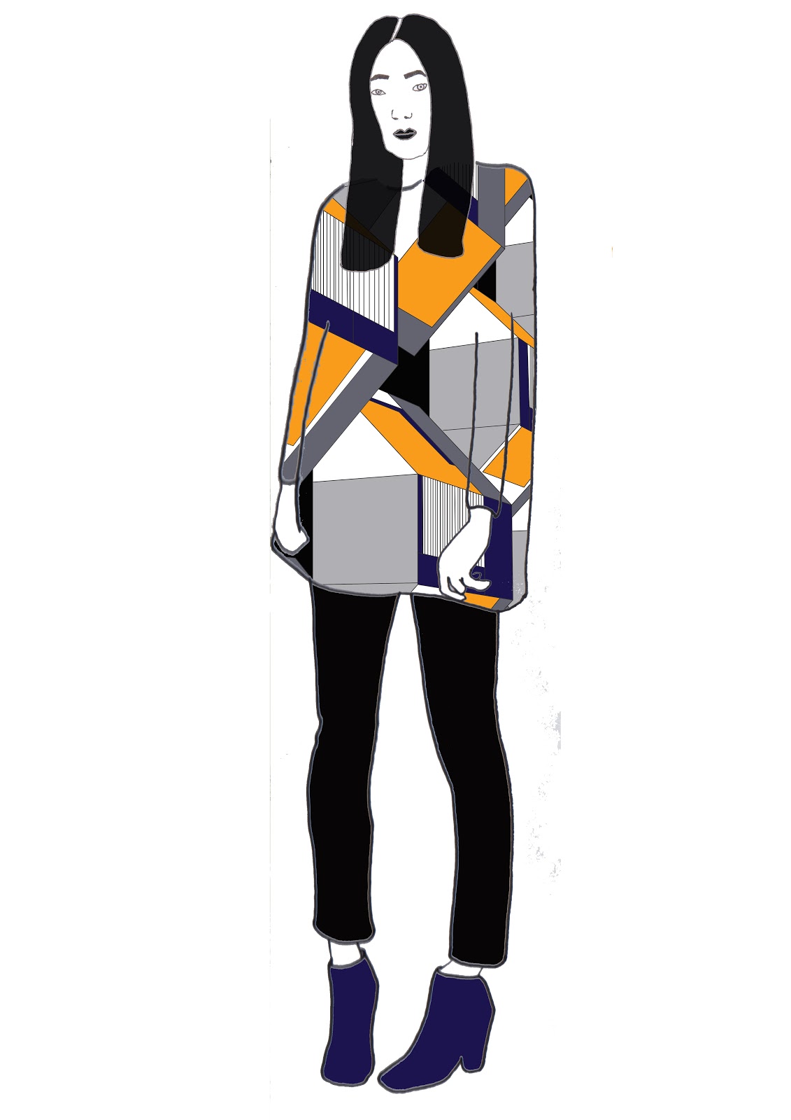
Each week we have been attending CAD workshops in which we have been learning the basics of Adobe Photoshop and Illustrator. I have really enjoyed these workshops as throughout my Foundation Diploma I was always in the CAD room experimenting with my designs and find these a really fun way to see my designs come alive and to see them in different colour-ways and scales. So to start with we learnt how to make our own brushes which is something really useful to know as its such a quick and easy way to begin a pattern or a print (once you've learnt how!). We also scanned in our technical drawings and enhanced them on Illustrator, this allowed me to make my work look more professional and presentable, I definitely prefer this method to a hand drawn flat. Here is an example of something which I created, showing easy ways in which to show a print on a garment.


Here I tried to experiment with colour and scale as at the moment I am still unsure of what my colour palette could be. The final image here is a preset tool within Photoshop which created this weaving look for me, although I think the pattern is interesting it does not work with the drawing that I have scanned, the colours also are too random and are not my style at all. In the future I will experiment more with colours, preferably bolder and much more vibrant colours.