I thought more about the layout of the trend book and the uniformity of each page in this next image. I feel that once I create a basic layout it will be easy to transport all of the information into the pages. Also I may add more colours to the colour palette. Changes to the font need to be done too.
Showing posts with label Colour. Show all posts
Friday, 7 February 2014
First Colour Palette
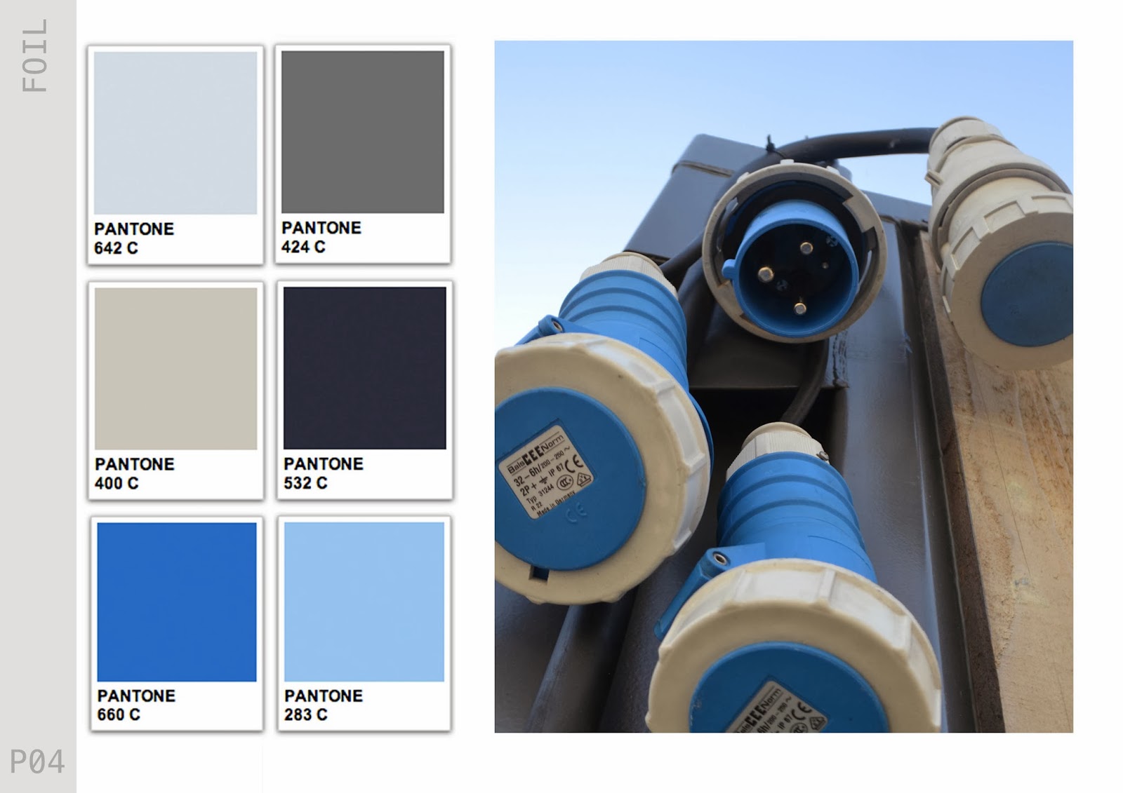
Today I have developed my first colour palette for the 'Conceal' half of my trend. Its quite a subdued palette, with a mixture of greys and blues, which will be quite a contrast to the 'Reveal' half of the trend. I hope to create two colour palettes for each 'Conceal & Reveal'. Firstly I just put the colours down not he page without thinking too much into it. Then on second glance I felt it lacked the sophistication that I want behind my work. So I took to the Pantone website to allow me to present my colour palette more successfully.
Sunday, 2 February 2014
Salford Quay
So after discussing looking for more 'futuristic' and 'architectural' influences in my tutorial, I took a trip to Salford Quays and Media City. I have been there a few times but never really took much time to appreciate it. The area has some great pieces of architecture, particularly the Imperial War Museum and The Lowry. My earlier research has been mainly looking at small little things so it was good to get a wider perspective. The shapes and shadows that the buildings create are something I will use to influence my own design.
The time of day that I have taken these images is perfect. I have really been inspired by the colours and think I may have found my colour scheme. I am going to take these images into photoshop and create a more concrete colour theme for the project.
Saturday, 25 January 2014
Composition
Composition is a key element to my trend book. The layout is something that has to spark inspiration so it is important that the composition is perfect. When I looked at Promostyl, I felt that the pages were very cluttered. My style is more simplistic. I want to choose specific imagery to hint at my trends. Here are a few examples of my first compositions for my trend books. These would be used as pages to show my 'Industrial' part of the trend, these would be followed by Colour charts, fabric samples and my own illustrations to demonstrate how the trend could be interpreted.
Thursday, 16 January 2014
Thinking Colour..
After the tutorial we have been told to start thinking about what colours we would like to include within our projects. As I am creating a trend book I am finding it hard working out in which order I work like this. Knowing what colours I am going to include in the trend book will help me when choosing my final images.
I would definitely like to include is Radiant Orchid, which Pantone have named as their colour of the year. So I feel it will be a very upcoming colour within fashion. It will also lend itself well to my concept of 'opposites' i'm thinking Industrial VS Feminine
Friday, 22 November 2013
Final Prints
These are my final designs from this project. I am quite happy with the end result especially when I compare them to my first designs. The colour palette I have used works really well together and I feel has been used evenly throughout the designs. Also looking through my initial drawings and ideas, I feel that these designs are a reflection of my initial ideas and primary research. Using this amount of colour has definitely been a learning curve for me, as I was quite scared to used colour, so this has been quite a risk for me.
Tuesday, 19 November 2013
Print Room Day 1
After developing a number of digital designs I thought it best to experiment with the Print Room. Last year I did not have the best time in the Print Room, and do not particularly enjoy it, so this was a risk for me. However I felt that I needed to take this step in my project to make sure that I have explored all possible avenues for my project to go down. My main aim in the print room was to experiment with composition, colour and texture. I chose fabrics that I thought would work well as a garment rather than fabrics that would work well with the dyes (big mistake) but some interesting end results.
These first two images are of some thick jersey fabric I used pigment dyes on, I used a combination of screen printing and painting onto mesh and printing directly with it. The effect that the mesh has given reflects the 'urban' brief that I was originally given, its quick and rough and it not perfect which is what I like most about it, although I do not like the over all end result I am happy that I have done this as it has encouraged me to improve my digital skills and include more of the mesh within my digital designs.
The next two images are firstly of purple vinyl, which I could not set the pigment dyes on as it would wash straight off. However I really like the effect the pigment dye has on the vinyl, the motifs are slightly opaque, like a layer on photoshop. In the next image I have added some pearl pigment to the dark grey I had been using. I really liked the way the pigment looked in the pot as it reflected back to one of my primary images of petrol in a puddle, it gave this reflective, metallic, silky effect. However when applied to this synthetic fabric it did not have the desired effect.
Something that I have realised since being in the print room is that I need to spend a lot more time on getting my colours perfect. Although I may think that the colours suite my colour palette at first, when applied to fabric these colours are a lot different. Here I have experiment with clashing colours. Over all I do not like anything that I produced within the print room. However I am going to experiment with foils as I think that this could be used as a finishing effect on my digitally printed samples.
Tuesday, 12 November 2013
Layer Masking
After attending a digital workshop on monday I decided to experiment with my digital skills, as I love using photoshop but feel it is good practise to constantly upgrade your skills. So I started to experiment with Layer Masking. This is due to the fact that I have been trying to add my prints to my illustrations, although I have been successful with this, the final outcome could be a lot cleaner and neater.
The guideline uploaded to moodle suggests using a white garment, however I chose a grey background as it fits in with my colour palette. I also edited the print that I copied into the mask as I followed Alex's advise and toned down the colour palette. This was achieved by adjusting the brightness and contrast panel in photoshop.
I am happy with the result of this and will definitely use this technique in future and to give my work a much more professional finish. Also the 'sheer' effect that Alex suggested has been achieved here too, I will follow this through with the rest of my designs throughout this project.
Monday, 11 November 2013
Illustrations
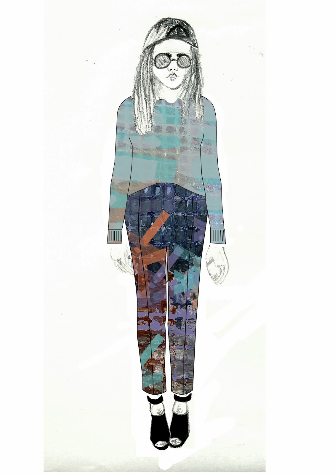
After last weeks tutorial I was told to add more detail to my illustrations and play around with styling. I worked into this illustration with pencil, however I do not feel that this is my style and will develop further my illustration skills. Although I feel that this is a lot better than my first attempt I plan to still work at my technique.
Personally I do not like either of these but I experimented with layering garment flats over the illustration (right). I prefer the left hand image but Alex feels the colours are too over powering and need to be toned down to achieve a more sheer effect.
I have been thinking about scanning in my fabrics that I bought last week to add into my illustrations either to add into the background or to use as accompanying garments with the prints.
Sunday, 10 November 2013
Fabrics
I have been concentrating this past week on getting myself into the print room. Currently I am just waiting for my screen to be developed and I have booked some time for wednesday and thursday, in the print room, as these were the earliest dates that I could get in there. In hindsight I should have booked this time a lot earlier as I currently have nothing physical to show in my tutorial tomorrow.
So I went to Abakhan's fabric shop, which I have never been to. It was amazing! I picked up quite a range of fabrics, some vinyl effect, thick jersey, and also some satin. I wanted a range, in texture and colour, so that I could experiment in the print room. I mainly looked for a range of greys to use as a base background. Although my fabrics are not usually what you would pair together I like the contrast between the textures.
Tonight I plan to develop some more illustrations which will suite my customer more. I am also going to look over the Photoshop 01 workshop handout to further my skills within photoshop.
So I went to Abakhan's fabric shop, which I have never been to. It was amazing! I picked up quite a range of fabrics, some vinyl effect, thick jersey, and also some satin. I wanted a range, in texture and colour, so that I could experiment in the print room. I mainly looked for a range of greys to use as a base background. Although my fabrics are not usually what you would pair together I like the contrast between the textures.
Tonight I plan to develop some more illustrations which will suite my customer more. I am also going to look over the Photoshop 01 workshop handout to further my skills within photoshop.
Monday, 21 October 2013
Mood Boards
I have been trying to create some inspiration for myself using the images that I have collected over the past week. I have put these images into a few mood/ colour boards to help me decide what colours I want to use throughout this project and what style of design and customer I am aiming towards.
Between the two mood/ colour boards I think the first one is my favourite and demonstrates the style of designs I want to create. The colours within the second board are a bit all over the place on reflection. I really like the combination of the orange and green however I feel that the rose and pink do not fit in. I still want to include some more muted tones of grey, adding gradients into the backgrounds possibly.
My next step throughout the project will be to scan all of my drawings into Photoshop and Illustrator and start to play around with different brushes and colour palettes to try figure out a much more defined path to follow. This is the part of the process I love, so hopefully I will have a larger quantity of work very soon. However with this in mind, I will still carry on drawing to improve my drawing skills and to keep up with the momentum of inspiration.
Wednesday, 16 October 2013
Urban Safari #2
So today I wanted to recreate something that I learnt from Unit X last year, and go on an Urban Safari! Which is basically going around Manchester and using my camera to log everything that I saw that inspired me or interested me. Today I really wanted to concentrate on colour as this was something that was highlighted in my tutorial, so to end the day with a colour theme would be an achievement. Here are a few of the images that I have taken throughout the day.
I tried to take on board what Alex had said to me about ornate architecture, but when I was out I felt drawn to the more industrial side of the city rather than the ornate. The colours int he images are great as well I think that I could create some great drawings and eventually a great collection using this selection of colours.
Monday, 14 October 2013
Summer Brief
Over the summer we were given a brief to keep a record of any cultural activity we were involved in, and to also keep track of different artists who influence us or work in the same way to ourselves. These artists did not have to be specifically textiles artists as we have been encouraged to explore all creative paths to seek inspiration.
My main focus this summer has been collecting visual information and inspiration. I have visited Sharm El Sheik in Egypt and Rome over the summer and have mainly sourced imagery from these places. The architecture in these cities have inspired me throughout the summer and I have enjoyed working from these images and developing the research further to show in my first tutorial back to uni.
Egypt was such an exciting bustling place to be and there was constantly something going on. The amount of design and print that I saw was amazing and really got me excited to start my second year at uni. What I loved most was the use of colour here, which I usually tend to stay away from, however this has allowed me to gain knowledge in how exciting colour can be and that I should jump straight in!
The images that I have chosen to upload here are examples of the mood I would like to create within my upcoming work with the new project at uni. I feel that they warm and exotic with a fun feel to them with the use of colour.
Wednesday, 8 May 2013
Group Meeting
Yesterday the group and I met to further discuss our final piece and our exhibition space. As we had all came to the decision that we would like to use Fred Aldous to display our work, but no one had actually went and asked for the space, I made a phone call there and then to the shop. The shop owner told me that a lot of groups had already enquired about the space. I tried to work around this problem by asking if we could use the space for only an hour, just long enough to take some images and see everything all together in one space. He was happy with this idea and asked us to go down to the store and talk about it some more with him. Here is an image I have taken from the Facebook group we have, explaining what was said in the meeting with Fred Aldous.
It's not the news that we wanted but things like this happen We will just have to think of somewhere else, or exhibit it in the new art cafe, which has a large blnk wall. I did suggest tis yesterday but it fell on deaf ears. We have a tutorial tomorrow so we will have another chance to discuss this matter further and act much more quickly on the matter.
We also brought pieces of our work along to show one another and to see if our work still geled well together. This was good for us as we now know we need to incorporate more colour into the project and decided to go with the colours that Lizzie has been using so far.
Subscribe to:
Posts (Atom)