Showing posts with label Research. Show all posts

Friday, 14 February 2014

Daniel Heath

Todays lecture has been one of my favourite so far. Daniel Heath was really interesting and had some great advice for us. He even came back to the studio and we had an invaluable conversation that we were all grateful for. He gave us advice on always taking high quality images of our work and keeping up to date with it as it is important that you always have images to hand to show prospect customers and press interests. This also makes it easier for the press and they are more likely to give you more coverage.

Daniel Heath for Heals
He also told us the importance of getting your name out there, and the fact that every project may not be lucrative but they can always lead to more work which is always a bonus. Also about the production of 'gateway products' such as cushions. If someone buys one of your cushions they are more likely to buy a mirror to match or the wallpaper that is also part of that collection.

Daniel Heath for Retrouvius


Freelance design has never crossed my mind however the idea of a more 'organic journey' after university rather than working for someone sounds amazing. Being able to design for yourself without restriction and controlling which jobs you do and do not do. However the most important advice I feel he gave us was BE PROACTIVE, NOT REACTIVE.


Friday, 7 February 2014

First Colour Palette

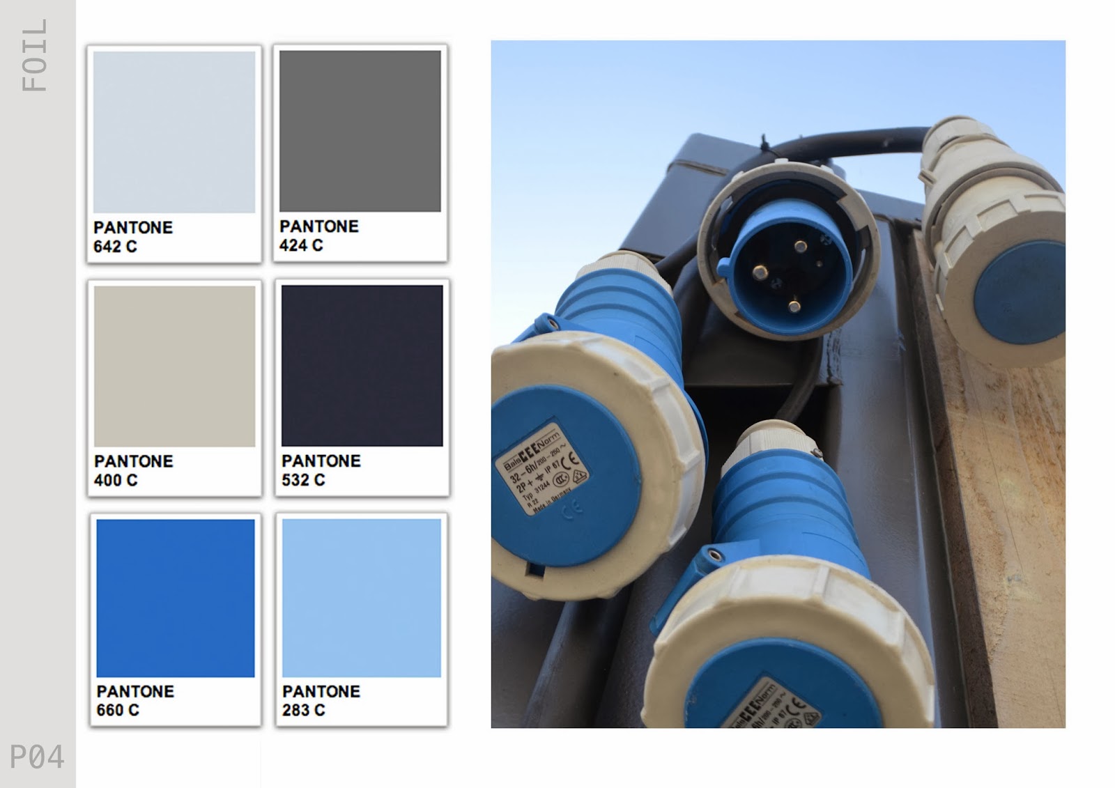
Today I have developed my first colour palette for the 'Conceal' half of my trend. Its quite a subdued palette, with a mixture of greys and blues, which will be quite a contrast to the 'Reveal' half of the trend. I hope to create two colour palettes for each 'Conceal & Reveal'. Firstly I just put the colours down not he page without thinking too much into it. Then on second glance I felt it lacked the sophistication that I want behind my work. So I took to the Pantone website to allow me to present my colour palette more successfully.

I thought more about the layout of the trend book and the uniformity of each page in this next image. I feel that once I create a basic layout it will be easy to transport all of the information into the pages. Also I may add more colours to the colour palette. Changes to the font need to be done too.


CONCEAL / REVEAL

After also thinking long and hard about the name for my trend and being told by Alex to be more 'pretentious'. I took to the online dictionary (again). I really liked my idea of 'hide and seek' but knew the phrase was too naive and not 'quirky' enough for a trend. I have looked at various websites WGSN and Vogue, to see what they name some of their trends, which are often a play on words, so this is definatley something I tried to and wanted to achieve.

Conceal/vReveal sums up my concept. Its a contradiction, yet compliments itself. I want the customer to know that there must be a juxtaposition within the trend, yet it is two things that are not usually put together. This also plays on my underlying concept around the idea of 'camoflage'. I am really happy with this name. My only regret is that I had come up with this earlier in the project.

FOIL

After endlessly looking for something to name my trend book I have found a name for my Trend Book FINALLY...

FOIL

foil 1 (foil)
tr.v.foiled, foil·ing, foils
2. To obscure or confuse (a trail or scent) so as to evade pursuers.

I originally typed in 'contrast' into the online thesaurus and 'Foil' was on the list. I like the idea of just having one solid word. It has no particular meaning to me however when I then searched for the dictionary definition I thought that it linked quite well to my underlying 'camoflage' concept. I also think that my layout and front cover will now fall into place around this as now in my head I feel that I know how I want everything to look. However this could all change...

Tuesday, 4 February 2014

Mind Maps

I have been looking for the name for my trend book, so I have been using a great online resource called Visual Thesaurus, it brings up a mind map of everything that relates to the word you search for. In future projects I would like to become more decisive. Throughout this project I have learnt the importance of making decisions quickly and standing by them to build momentum early in the project.


Monday, 3 February 2014

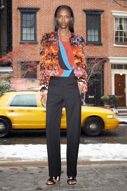
Runway Camouflage

Givenchy
Proenza Schoeler
Thinking about the concept of 'Camouflage' I have been researching into designers who have used this within there designs...

Antonio Marras


Sunday, 2 February 2014

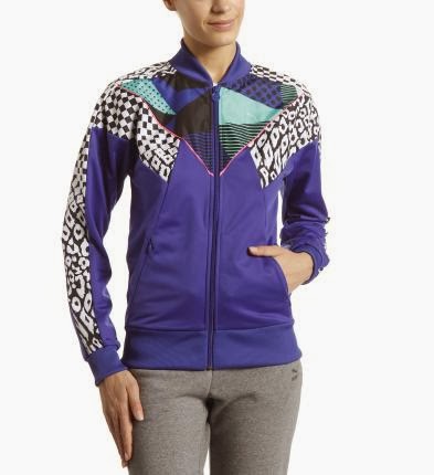
Nike / Puma

Firstly Nike is one of my main inspirations throughout my research into Sportwear, they have a diverse range of sportswear that include print. This is important as this will be the main feature when designing in my trend book. All of the products in these following images are ranged between £50 - £100, although Nike are still seen as quite high street, their product however does not lack in quality. They are always ahead of the game when it comes to fabric technology and provide of the moment garments for sportswear. I have chosen the following images as some contain simple placement prints, selective branding and 'all over' prints, showing Nike is not a one trick pony.


Puma do not have as much diversity as Nike or Adidas but there are not afraid to use colour, which is something I plan on using a lot of within this project. Puma's print are also very graphic and eclectic. They also provide sportswear for a wider range of sports and more 'wearable' technical sportswear. The products here range between £15 - £50 putting Puma at the lower end of the marker but maintaing an expensive look. Their use of fabrics are a lot less technical or advanced as those used in Nike products so I would like to bring that into consideration when selecting my fabrics.


Sports Wear

After making the decision to create the trend book for sportswear, I thought it would be best to start researching into who the clientele for the trend book would be. I still want it to be quite high street instead of high end so over the next few days I am going to look at a range of different brands, not just brands who supply gym wear but swimwear and other sports wear too, such as Nike, Adidas, Puma, Lululemon, Speedo and Fred Perry. Also some high streets brands such as H&M and Primark have started to bring in their own sportswear, so I will also be looking into these brands too.


Frank Gehry

Frank Gehry is one of the most important contemporary architect of our time. He has designed a number of buildings including the Walt Disney Concert Hall and the Guggenheim - Bilboa. It has been joked that he scrumples up a piece of paper, see's what shape it lands in and uses that as his design idea. As in some of his designs it does look like they could fall down at any moment, however also looking extremely well built at the same time. I have chosen to look into Frank Gehry for his forward thinking way of design. His buildings are like nothing I have ever seen, and as I have just recently visited Salford Quays it seemed only right to look further into the architect. He uses metal to reflect the sky, which everyday creates a different shade and shadow so it feels like you are never seeing the same building twice. It looks different from every angle and is in no way symmetrical. I want to take on board some of these theories and incorporate them into my own work.


Salford Quay

So after discussing looking for more 'futuristic' and 'architectural' influences in my tutorial, I took a trip to Salford Quays and Media City. I have been there a few times but never really took much time to appreciate it. The area has some great pieces of architecture, particularly the Imperial War Museum and The Lowry. My earlier research has been mainly looking at small little things so it was good to get a wider perspective. The shapes and shadows that the buildings create are something I will use to influence my own design.


The time of day that I have taken these images is perfect. I have really been inspired by the colours and think I may have found my colour scheme. I am going to take these images into photoshop and create a more concrete colour theme for the project.


Fashion Unfolding

Alex suggested I look at this book. To be honest at first glance I was quite confused as to why he suggested this to me. However it does have some good visual sources of how sportswear is advertised, and how graphics is used in fashion. If anything I have learnt different ways in which I can present the 'translating trend' pages in my trend book. It also has some great examples of placement prints.

Tuesday, 28 January 2014

Tutorial 27/01/2014

Todays tutorial was more of a one on one due to unforeseen circumstances. I tried to use the to my advantage. Here are the points that Alex made today..


  • Have more futuristic influences
  • Change the name from 'industrial', it reads too hard. Needs to be more poetic
  • Read 'Fashion Unfolding'
  • Look into Nike / Adidas / other sports brands and how they illustrate their designs
  • Search for a sportswear Live Project
  • Look into lulu lemon.com
  • Try gather more architectural influences, such as Frank Gehry
  • Visit the Imperial War Museum in Salford Quays
I feel a lot more clear headed after the tutorial. I have a mental list, and just need to go through it and tick everything off. I feel that if I work flat out from now till the deadline I will have a project I can be proud of.

Sunday, 26 January 2014

Concept Page

I have started to develop my Trend Book,(although I still do not have a name for the book or the trend!). I have interpreted the 'Distilled' trend in my own way and incorporated it into the styling of the book. Aesthetically I am pleased with the direction the book is going but I feel that I can push myself further and make it more exciting.


I'm still undecided on whether to make the trend book portrait or landscape, these are a few things I want to discuss with Alex in my tutorial tomorrow. I have written a list of topics I want to cover in the tutorial to fully use the small amount of time that we get to my advantage (hopefully). 

Saturday, 25 January 2014

Composition

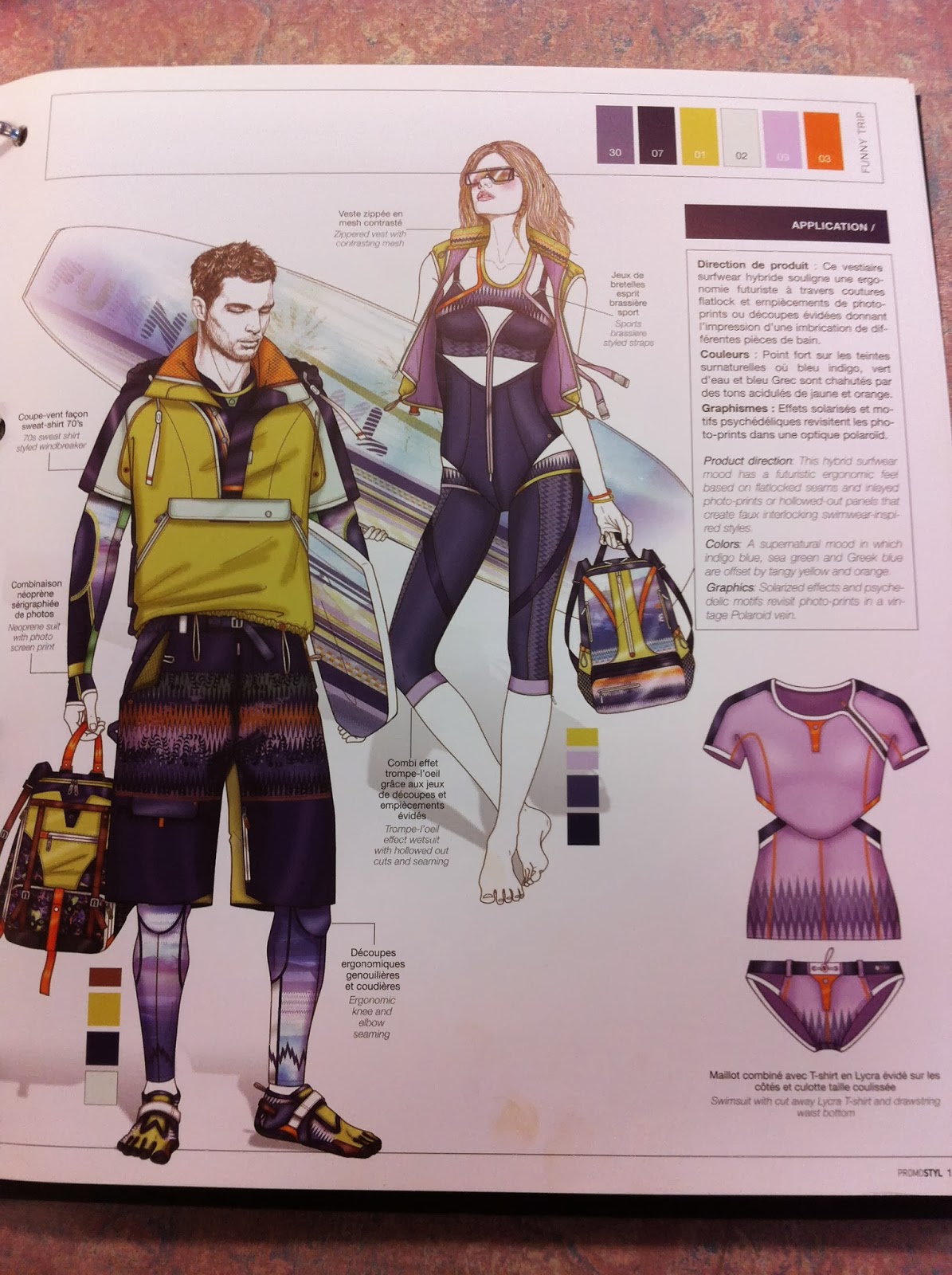
Composition is a key element to my trend book. The layout is something that has to spark inspiration so it is important that the composition is perfect. When I looked at Promostyl, I felt that the pages were very cluttered. My style is more simplistic. I want to choose specific imagery to hint at my trends. Here are a few examples of my first compositions for my trend books. These would be used as pages to show my 'Industrial' part of the trend, these would be followed by Colour charts, fabric samples and my own illustrations to demonstrate how the trend could be interpreted.


Tuesday, 21 January 2014

Opposites

I have been trying to think of what the opposite of 'industrial' is for a while now. I feel that my Trend Book cannot start to take shape until I am fully decided on these two things and then I can go straight ahead with it. Going around the city and taking photos of things to do with 'Industrial' has been quite fun, I am planning on going to the MOSI tomorrow to source some more inspiration from a source that I did not consider when first writing my brief.

Once I find this second source of inspiration I hope to feel ore involved within my own project and hopefully a lot more motivated than I currently am. However this being said I am determined not to give in and conform to just designing another print collection as I feel that stepping out of my comfort zone is essential to my progress within Textiles.

Industrial/ Domestic

Domestic: 
- relating to the running of a home or to family relations:
- of or for use in the home rather than in an industrial or office environment:
-(of an animal) tame and kept by humans
-(of a person) fond of family life and running a home:

After taking inspiration from Karen Nicol I went more into depth with the definitions of the words I was looking at. I then went onto looking at the opposites of these word. I eventually came up with 'Industrial & Domestic'. I have put two minds maps together to show my thoughts so far.


Spring 2014 Couture

I have been keeping up to date with Paris Couture Fashion week just to keep upto date with any current trends and I think it is important to keep up to date with current trends as well as upcoming trends for this project. Something which caught my eye was the Christian Dior collection, it had some structured elements running throughout with a feminine twist.

The result was an all-white, womblike space, inspired by the work of Valentine Schlegel, a little-known ceramist from the fifties who graduated to making "architectural suggestions" with biomorphic plaster jobs. To Simons, the interior represented "a radical, female gesture." 


Saturday, 18 January 2014

Promostyl

Researching into different trend books has been a major help especially when taking into consideration the content and composition of my own trend book. I want it to look different to any of the others that I have looked at, and all of the content is mainly going to my my own primary research so it will be a challenge. I'm very happy that I have taken myself out of my comfort zone and over the next two weeks I would like to get my first 5 pages complete.


The fold out page in Promostyl is quite interesting and adds a different dynamic to the book. I would like to add a little extra something to my own trend book to give it a little edge. This could possibly be a more interactive page with fabric swatches available.


 Including Contents Pages and Information pages had not crossed my mind until I looked through some trend books that are currently on the market. It will allow me to give a brief over view to my customer of what I foresee happening within future trends. However I would like to do this in a more visual way. There will still be explanations but more visuals for the customer to view.


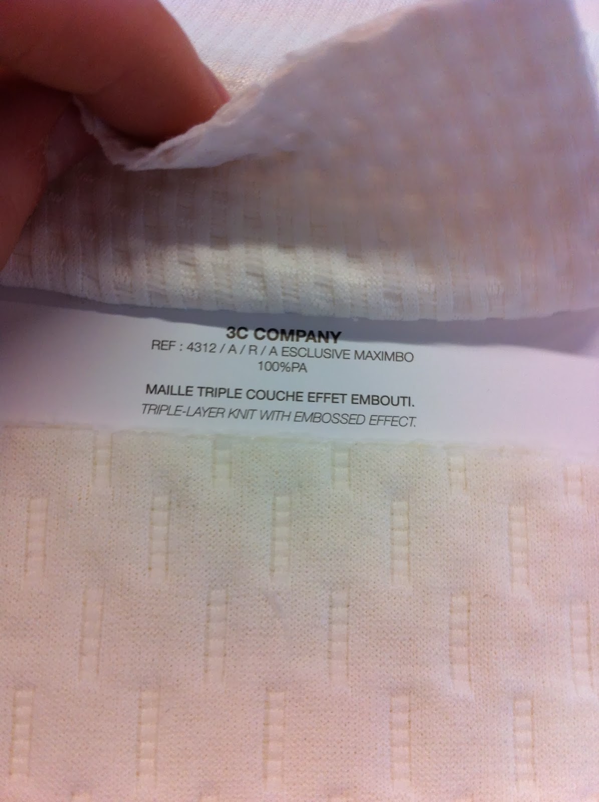
 The real fabric swatches and descriptions is something that has really stood out for me. I will include this within my own trend book as it makes the book more tactile and introduces my love for fabrics. I look forward to going into fabric stores and searching for the right shade and tone materials in the next few weeks.


At the back of Promostyl there is a little pocket with two lots of swatches. The first is colour swatches and the second is fabric swatches. The fabric swatches represent the colours that Promostyl have chosen, but the fabric are a lot cheaper than those that they have chosen to present. The colour swatches are a really good idea, all the names of the colours are on the front label so it is easy for the customer to know what they want after looking through the trend book. This is something I have taken on board and also plan to include within my own trend book.