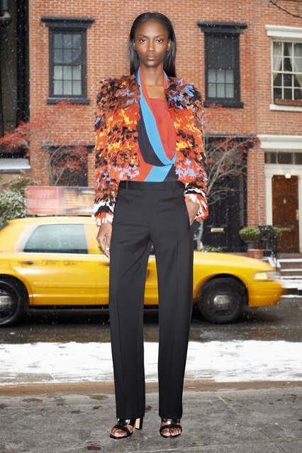
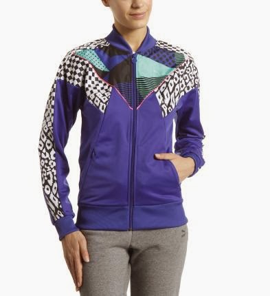
After discussing with Alex about creating a less 'finished', clean and clinical styled trend book, a blog that came to mind was Federated Unity. The blog is a hub for disturbing, juxtaposing and weird imagery. Although there are some gems of minimal and clinical images throughout the blog posts, they are juxtaposed with hard to look at images. Within our trend book we could use the idea of contradicting images on the same page as one another to create a more inspiring aesthetic, further blending the concept of 'containment | contamination'.
Showing posts with label Inspiration. Show all posts
Friday, 9 May 2014
Friday, 14 February 2014
Daniel Heath
Todays lecture has been one of my favourite so far. Daniel Heath was really interesting and had some great advice for us. He even came back to the studio and we had an invaluable conversation that we were all grateful for. He gave us advice on always taking high quality images of our work and keeping up to date with it as it is important that you always have images to hand to show prospect customers and press interests. This also makes it easier for the press and they are more likely to give you more coverage.
![]() |
| Daniel Heath for Heals |
![]() |
| Daniel Heath for Retrouvius |
Freelance design has never crossed my mind however the idea of a more 'organic journey' after university rather than working for someone sounds amazing. Being able to design for yourself without restriction and controlling which jobs you do and do not do. However the most important advice I feel he gave us was BE PROACTIVE, NOT REACTIVE.
Sunday, 9 February 2014
Stella McCartney for Adidas
Stella McCartney designed a range of gym wear for Adidas, the designer says that her whole collection although based upon sustainable textiles, was more about making the women wearing it feel good. She had spoken to top athletes and even they had said that they feel like they work better when they feel tat they look good. I love the futuristic feel behind her designs and how wearable the designs are. I want to keep this consistent with my own designs.
"I want to inspire women to get their sweat on. We work with top athletes,and even they tell me they perform better when they feel like they look good. It's a confidence thing." Stella McCartney
Monday, 3 February 2014
Runway Camouflage
Sunday, 2 February 2014
Nike / Puma
Firstly Nike is one of my main inspirations throughout my research into Sportwear, they have a diverse range of sportswear that include print. This is important as this will be the main feature when designing in my trend book. All of the products in these following images are ranged between £50 - £100, although Nike are still seen as quite high street, their product however does not lack in quality. They are always ahead of the game when it comes to fabric technology and provide of the moment garments for sportswear. I have chosen the following images as some contain simple placement prints, selective branding and 'all over' prints, showing Nike is not a one trick pony.
Puma do not have as much diversity as Nike or Adidas but there are not afraid to use colour, which is something I plan on using a lot of within this project. Puma's print are also very graphic and eclectic. They also provide sportswear for a wider range of sports and more 'wearable' technical sportswear. The products here range between £15 - £50 putting Puma at the lower end of the marker but maintaing an expensive look. Their use of fabrics are a lot less technical or advanced as those used in Nike products so I would like to bring that into consideration when selecting my fabrics.
Sports Wear
After making the decision to create the trend book for sportswear, I thought it would be best to start researching into who the clientele for the trend book would be. I still want it to be quite high street instead of high end so over the next few days I am going to look at a range of different brands, not just brands who supply gym wear but swimwear and other sports wear too, such as Nike, Adidas, Puma, Lululemon, Speedo and Fred Perry. Also some high streets brands such as H&M and Primark have started to bring in their own sportswear, so I will also be looking into these brands too.
Frank Gehry
Frank Gehry is one of the most important contemporary architect of our time. He has designed a number of buildings including the Walt Disney Concert Hall and the Guggenheim - Bilboa. It has been joked that he scrumples up a piece of paper, see's what shape it lands in and uses that as his design idea. As in some of his designs it does look like they could fall down at any moment, however also looking extremely well built at the same time. I have chosen to look into Frank Gehry for his forward thinking way of design. His buildings are like nothing I have ever seen, and as I have just recently visited Salford Quays it seemed only right to look further into the architect. He uses metal to reflect the sky, which everyday creates a different shade and shadow so it feels like you are never seeing the same building twice. It looks different from every angle and is in no way symmetrical. I want to take on board some of these theories and incorporate them into my own work.
Friday, 31 January 2014
I went for a walk around the Northern Quarter to gather some more inspiration and went into the Manchester Arts & Craft Centre, it had some really interesting artists studios, one that caught my eye was 'Sausage Dog' by Harriet Godden. I loved that you can see the artists at work in their studios as well, some of the work was amazing and looked like something I would enjoy doing after uni. I might contact some of the artists who rent studios there to see if I could gain some work experience from them.
I also went into 'Magma' one of my favourite stores in the Northern Quarter, it gave me a little inspiration towards what the front cover of my trend book could look like.
Monday, 16 December 2013
Tutorial 2 16/12/13
Todays tutorial was slightly stressful as I had not done either of the tasks that Alex had asked us to complete as I had been busy concentrating on my essay. However we did go over quite a few things which have put me in good stead for the holidays. These are some of the points that I noted.
- If I make a collection it needs to be broader
- Take a look at trend books and fashion journals
- Trend does not have to be social issue, could be two things that have never been put together before
- Carry out primary research, make mood boards from them and respond through drawing
- Aimed towards Womenswear
- Try and let the trend just 'happen' don't try to over think it or force it
- Take photographs of everything and anything that interests me
- Highstreet brands take trends from Trend Books more literally as apposed to Highend
- Do not need to design a whole collection, just 'responses' to the Trend Book
- Come up with a name for the trend
- Come up with a name for the Trend Book
These are just a few points that I need to consider over the holidays. I plan to keep up my momentum and not try let the holidays slow my pace of work down too much as I want to come back to the next tutorial with quantity. My aim over the holidays is to have this full list completed and have a trend to start researching into. The key to this is going to be my primary visual research, I just need to keep collecting and refining it all.
- If I make a collection it needs to be broader
- Take a look at trend books and fashion journals
- Trend does not have to be social issue, could be two things that have never been put together before
- Carry out primary research, make mood boards from them and respond through drawing
- Aimed towards Womenswear
- Try and let the trend just 'happen' don't try to over think it or force it
- Take photographs of everything and anything that interests me
- Highstreet brands take trends from Trend Books more literally as apposed to Highend
- Do not need to design a whole collection, just 'responses' to the Trend Book
- Come up with a name for the trend
- Come up with a name for the Trend Book
These are just a few points that I need to consider over the holidays. I plan to keep up my momentum and not try let the holidays slow my pace of work down too much as I want to come back to the next tutorial with quantity. My aim over the holidays is to have this full list completed and have a trend to start researching into. The key to this is going to be my primary visual research, I just need to keep collecting and refining it all.
Sunday, 24 November 2013
Antipodium
Throughout this project I have been constantly looking for more inspiration and research into a variety of companies. Antipodium is a design house which stood out to me the most, I had never really bothered to look at their work till recently. I felt a strong connection to their work as their customer is the same market that I am aiming my own design towards. A bold, sophisticated and young woman who is not afraid to make a statement. The cut of their clothes is simple but the design is bold, along with their colour palette. Also I noticed some of their inspirations for their most recent collection where similar to my own, looking at CCTV as part of my urban influences brief their new collection is actually called 'Sex, Lies & CCTV'.
Thursday, 7 November 2013
Trends: Web Sights
I have been thinking a lot about who my customer is. My customer is a 20 something socialite, who enjoys being comfortable and effortless.
I have been researching into upcoming trends, and something that caught my eye was 'Web Sights'. Which linked into my project as I have been looking into using similar techniques within my work.
3.1 Phillip Lim's Resort 2014 is quite similar to the colour palette and style I have been working towards with my own collection throughout this project. Although there is no print here there is a sportswear vibe which I am really liking at the moment. I feel that sportswear is peaking at the moment within my age range and my customer has an eclectic style. Within my range I would like to have varying layers, sheer fabrics and contrasting textures, however keeping in theme with sportswear.
I have been researching into upcoming trends, and something that caught my eye was 'Web Sights'. Which linked into my project as I have been looking into using similar techniques within my work.
![]() |
| 3.1 Phillip Lim |
![]() |
| Derkek Lam |
Monday, 21 October 2013
Mood Boards
I have been trying to create some inspiration for myself using the images that I have collected over the past week. I have put these images into a few mood/ colour boards to help me decide what colours I want to use throughout this project and what style of design and customer I am aiming towards.
Between the two mood/ colour boards I think the first one is my favourite and demonstrates the style of designs I want to create. The colours within the second board are a bit all over the place on reflection. I really like the combination of the orange and green however I feel that the rose and pink do not fit in. I still want to include some more muted tones of grey, adding gradients into the backgrounds possibly.
My next step throughout the project will be to scan all of my drawings into Photoshop and Illustrator and start to play around with different brushes and colour palettes to try figure out a much more defined path to follow. This is the part of the process I love, so hopefully I will have a larger quantity of work very soon. However with this in mind, I will still carry on drawing to improve my drawing skills and to keep up with the momentum of inspiration.
Monday, 14 October 2013
Summer Brief
Over the summer we were given a brief to keep a record of any cultural activity we were involved in, and to also keep track of different artists who influence us or work in the same way to ourselves. These artists did not have to be specifically textiles artists as we have been encouraged to explore all creative paths to seek inspiration.
My main focus this summer has been collecting visual information and inspiration. I have visited Sharm El Sheik in Egypt and Rome over the summer and have mainly sourced imagery from these places. The architecture in these cities have inspired me throughout the summer and I have enjoyed working from these images and developing the research further to show in my first tutorial back to uni.
Egypt was such an exciting bustling place to be and there was constantly something going on. The amount of design and print that I saw was amazing and really got me excited to start my second year at uni. What I loved most was the use of colour here, which I usually tend to stay away from, however this has allowed me to gain knowledge in how exciting colour can be and that I should jump straight in!
The images that I have chosen to upload here are examples of the mood I would like to create within my upcoming work with the new project at uni. I feel that they warm and exotic with a fun feel to them with the use of colour.
Wednesday, 1 May 2013
Andrew Brooks, Photographer
Today we had a lecture with Andrew Brooks, who is a well established photographer who is originally from Manchester. He takes a lot of his photographs in and around Manchester, which immediately related to Unit X. Personally I was hoping for more of a fashion based photographer as that relates more to what my group are doing, however I still took the time to appreciate his work. I particularly enjoyed his 'Hidden Manchester' images in which he had teamed up with producer and curator Andy Brydon. This collaboration works well as Brydon does the research and writing and Brooks does the recording and photography. This is would have been quite similar to our project if our film students had turned up.
What interested me most about his work is that he said it can take him unto a month to create one shot from around 20/30 shots. He puts all of these images together on photoshop, these images can come from anywhere but he always has his final shot in mind. Andrew also adds himself into each one of his shots where possible. Although I feel his work has not related very well to what I am doing I still appreciated his work and learnt a lot about photography.
Tuesday, 30 April 2013
175 Defaces of Chemistry
When I have been looking into stitching into photography and distorting our imagery I have became more enchanted by the idea of 'defacing' the face. Over the next few days I am going to experiment with this further, using the imagery that the group have shared with one another, collaging this, distorting it and then bringing in this concept of 'defacing'. However I am yet to share this idea with the group, we have a tutorial later this afternoon and then we are going to meet to discuss our ideas further straight after, I will use this time to ask them their thoughts on the idea.
de·face
[dih-feys]
verb (used with object), de·faced, de·fac·ing.
1.
to mark the surface or appearance of; disfigure: to deface a wall by writing on it.
2.
to efface, obliterate, or injure the surface of, as to make illegible or invalid: to deface a bond.
Maurizio Anzeri
After the last tutorial, the rest of the group and I were really keen to look into stitching into the photographs that we had already taken to create a more textured, 3D feel to the photography. I have been looking further into this over the past week and have found some interesting works by Maurizio Anzeri. He is a Graphic Designer who collects images from flea markets and car boot sales, he never actually knows the subject in his work.
"His embroidered patterns garnish the figures like elaborate costumes, but also suggest a psychological aura, as if revealing the person’s thoughts or feelings."
The above images have been taken from a piece that Maurizio helped out on for Dazed and Confused magazine. He did not take the photographs, he just contributed the stitch to an already styled shoot. I much prefer this work than his work with vintage photographs, it is sleeker and more contemporary.
I have found Maurizio's work very inspiring, to me the stitch looks very Spirographic. The geometric stitch is juxtaposed by the vintage photographs used as a back drop. The stitching actually transforms the photographs and almost changed the character of the subject. My group are looking at distorting the face however I like the concept of 'defacing' the face.
Wednesday, 24 April 2013
Satin Stitch
I have drew a small drawing of a little girl in fine liner, I have then used some embroidery thread to stitch into the image. This was inspired by an artist named Hagar van hu, whom I found on Pinterest. Their way of working has really appealed to me throughout this project as I feel it links to a lot of the criteria that our group is trying to reach. Portraiture, distortion and covering the face. This is just a basic idea at the moment but I would like to discuss this further with the group in our next tutorial, bringing in the ideas of 3D and texture.
To take this idea further, it could be done on a much larger scale, on a number of different materials and textures, and also in many colour ways. This is all down to experimentation which I plan on carrying out in the upcoming days left of the project. However, our group is yet to settle on an idea for a final piece, so I will act quickly on this experimentation in order to settle on a final piece soon.
Continuation of Work
So yesterday I posted about the pastiche I was doing, I have sort of finished the piece, I did not complete the full thing as I felt the idea was translated well already and it was just an initial piece to showcase an idea that I had about creating texture within an image by stitching into it.
I dont think that this is one of the best pieces of work that I have done but it certainly portrays the concept. The concept of expression really stands out to me here. The group and I have spoken about the idea of expression, using more peculiar facial expressions than general model-like poses. We have discussed the idea of covering the face or highlighting certain areas of the face, which I will no explore. Instead of using machine stitch I am going to look into hand embroidery to see if I can create a softer texture.
Tuesday, 23 April 2013
Making Progress
I really feel like I am starting to make some progress finally within this unit! It has taken a while but slowly but surely it is coming along. I have dug out my sewing machine and made a start on my pastiche of Nikos Gyftakis' work. It is coming along a lot better than I expected. The only struggle I am having so far is the heaviness of my lines and the contrast between light and dark. The face is quite hard to copy as the skin is stretched into every direction possible, so to keep one fluid line is also quite difficult. This is an image of the progress that I have made so far, I will post an image later when I have completely finished the piece.
I think that the fingers have worked the best throughout this process, however I do need to define these more, as I have only used three of the 5 colours I plan to use. It's not perfect, but it is a start! I really like the texture that this technique creates, however for me, it is not polished enough. I have also been looking into distorting the face, using my scanner at home I scanned a few images of my face to see what the outcome would be like. The final images are slightly strange and I do not think I will be taking this any further.
Saturday, 20 April 2013
Sketchbook Work
I have been looking into a few different artists, which I have mentioned on my blog before, today I have been looking further into Nikos Gyftakis, like I said before the use of colour and expressive fluid lines really spoke to my style of work. I have attempted to recreate his way of working. The outcomes are better than I expected however still need improvement. To develop this work further I am going to try recreate his work using the sewing machine, creating the lines with stitches and the couching technique. I plan to do this as I feel it links to my textile course a lot more than what my group are doing at the moment.
Subscribe to:
Posts (Atom)