
Showing posts with label Fashion. Show all posts
Showing posts with label Fashion. Show all posts
Sunday, 24 November 2013
Fabric Samples
My final designs have been taken to digital print. I chose Crepe De Chine as it was light, kept the colour vibrancy but also remained looking expensive and sheer. The outcome of my designs on this fabric is amazing, I love the finish of the design and has made me feel a lot better about this project as a whole. Putting my designs onto fabric has really put my work into context and I could see the prints as an actual fashion fabric, rather than just a 2D design on photoshop. Although I have experimented in the print room with fabrics I feel that using digital print was definitely the best decision for myself and my designs. This has also allowed me to view my work as a collection rather than a group of designs.


Tuesday, 19 November 2013
Adding Designs into Illustrations
After teaching myself how to use layer masking, I have been referring to my technical notes a lot and using this technique with my new illustrations. There are a few things that can be tweaked, other than that I am very happy with this design. I see my designs working more as placement prints or using certain areas of one particular design as apposed to a full ' all over ' print. I have also tried to work on my style like Alex asked in previous tutorials, and I feel that looking back at my original illustration that this is a vast improvement.


Thursday, 7 November 2013
Trends: Web Sights
I have been thinking a lot about who my customer is. My customer is a 20 something socialite, who enjoys being comfortable and effortless.
I have been researching into upcoming trends, and something that caught my eye was 'Web Sights'. Which linked into my project as I have been looking into using similar techniques within my work.
3.1 Phillip Lim's Resort 2014 is quite similar to the colour palette and style I have been working towards with my own collection throughout this project. Although there is no print here there is a sportswear vibe which I am really liking at the moment. I feel that sportswear is peaking at the moment within my age range and my customer has an eclectic style. Within my range I would like to have varying layers, sheer fabrics and contrasting textures, however keeping in theme with sportswear.
I have been researching into upcoming trends, and something that caught my eye was 'Web Sights'. Which linked into my project as I have been looking into using similar techniques within my work.
 |
| 3.1 Phillip Lim |
 |
| Derkek Lam |
Tuesday, 16 April 2013
Zero-Waste Pattern Cutting - Fiona Mills
Today we had quite an interesting lecture about sustainable fashion. Basically the concept of zero waste fashion is to use the full yield of the fabric provided and to not let anything hit the cutting room floor.
There is at least 15-20% fabric waste within fashion construction, this wasted fabric goes into landfills, does not breakdown and therefore becomes toxic to the environment. I did not know this and it came as quite a shock. The yield of a fabric in a lay plan is obviously very important to companies in the lower market, who want to get more garments made from their fabric as possible. Fiona showed us many different researchers who had looked into zero waste fashion in a lot of depth.
Most of the designers that Fiona showed to us today were mainly researchers and did not actually sell any of their designs. Some of their designs I would personally not buy, however I love the concept and think it is extremely interesting. These designers entered a competition called YIELD. A particular design which I loved was by Timo Rissanen, who produced a jacket which just seems genius.

There is at least 15-20% fabric waste within fashion construction, this wasted fabric goes into landfills, does not breakdown and therefore becomes toxic to the environment. I did not know this and it came as quite a shock. The yield of a fabric in a lay plan is obviously very important to companies in the lower market, who want to get more garments made from their fabric as possible. Fiona showed us many different researchers who had looked into zero waste fashion in a lot of depth.
Most of the designers that Fiona showed to us today were mainly researchers and did not actually sell any of their designs. Some of their designs I would personally not buy, however I love the concept and think it is extremely interesting. These designers entered a competition called YIELD. A particular design which I loved was by Timo Rissanen, who produced a jacket which just seems genius.

Wednesday, 10 April 2013
Ernesto Artillo
One of the girls in the group posted an image from an artist she had found and I thought it was extremely inspirational. So I looked a bit further into the artist and found a few images that I thought related well to our project and could help us develop our concept further.I find these collages really interesting as they are very abstract, this is something I would like to look into myself.


Sunday, 24 February 2013
Relating Designs
After establishing what my design were going to look like I started to look into different designers, I found a few images from Holly Fulton's F2012RTW collection which I felt really related to my designs. I feel that these designs relate to my own work and prints, more specifically my digital work rather than my screen prints, as she has used a gradient effect, which I have also used.


Some of the colours in Holly Fulton's designs are also quite similar to that of my own. The bright pinks and the deep reds really stand out against the darkness of the black and create a beautiful contrast.
However, one designer which has stood out to me is Peter Pilotto, especially his Resort 2013 collection. The colours are so similar to mine and have really shown me how I can proportion my awkward colour scheme to my advantage. The composition of his prints are exquisite and I wish I had seen this collection a lot earlier in my project as I would have been able to use this inspiration in a much more productive way. Here are the images that I have found and been inspired by.


The colours in these specific designs are really similar to that of my own. I also feel that they have been used in the same proportions as my own, the purple and reds are the most dominant with a hint of green and orange, which I what I have been trying to achieve myself.
Monday, 10 December 2012
Evaluation of Origins Unit
Throughout this project, drawing was the key aspect. Although during the first two weeks or so of the project I was feeling really uninspired and unmotivated, I did not feel as though this was the right world for me and that I was slightly out of my depth. This lead to my work becoming quite slowly produced and if I had gotten into uni more on my days off I feel that maybe this could have changed, or possibly I just had not done enough research. I will not let this be a factor within this next project. However from following out a number of drawings from different galleries and day to day objects I was able to come up with the concept of 'Multiples'. This concept immediately inspired me and I began to draw a lot, experimentation was key within this project as we had to eventually design a print that would then go towards a collection.


My inspirations firstly came from the mood boards that we were asked to create. We had to carry out this activity twice as we had misunderstood the brief the first time around. Personally I was glad that we had to do this again as I was not inspired at all my the first mood board we had created relating to 'Opposites Mixed Up'. The drawings which I produced throughout this week were quite expressive, which is exactly the type of drawing that I wanted to produce. Looking back I wish I had created a lot more drawings that were more relevant to the course and the brief over all. The reason that I feel this is that some of my drawings were not relevant and were not used, I could not develop them further, which I should be able to do with each and every one of my drawings.


From the above images it is clear to see how my illustrations have developed from the 'Fashion Illustration for Dummies' tutorial to my final piece. Personally I am rather proud about how these have developed, as I was going to just settle for the first drawing but this was not an option, I knew that my first drawing was not good enough so I sat for hours trying to draw something I was happy with. Finally I produced the second image which I felt just clicked. The digital aspect of TD4F has really inspired and motivated me within this project as I find Photoshop and Illustrator extremely user friendly and some what easy to use and feel that this was definitely one of my strong points throughout the project. Although I already had experience using Photoshop, this was my first time using Illustrator, I was also able to learn lots of new things in Photoshop which allowed me to produce work faster and I am really glad that I had attended the CAD workshops as they are so useful. This definitely allowed me to develop and explore my skills within this area.

These skills have allowed me to produce this final design board, which is one of 6 final boards that I eventually created for the end of the project. I feel that my fashion flats could be more technical as at the moment they look more free hand, I will work on this when I next revisit this world, I feel that more time using illustrator could also give me an advantage within this area. The scale of the garments could also do with being slightly reduced. The one this that I am certain worked out well in this board is the garment on the illustrations. They are graphic, bold and contemporary which is fundamentally what I was aiming to do. I feel that my independent study time would be better used in the studio space rather than in my flat. Although I have enjoyed working at my own pace and with my own surroundings, it is essential that I use the space that has been provided in order to allow me to become inspired and to ask for guidance when and if I need to do so.
Overall I feel that this TD4F project has been successful which also reflects in the grade that I was given, I have enjoyed it but feel that there are still things that I need to improve upon in the future. Points that I would like to improve upon are my allocation of time and space, spend more time surrounded by other practitioners in the studio space. Visit more galleries and exhibitions to absorb inspiration and widen my knowledge of media. Finally to act upon my ideas immediately and to produce work not only faster but that is also more relevant in order to not get stuck and to power through.
Wednesday, 14 November 2012
Inspiration
Throughout this project I have learnt the importance of research and inspiration. Looking through websites such as Vogue.com has helped me to stay on track and to develop and challenge myself in my work. I have put together some images that I feel relate well to my work.


Stella McCartney has used a similar colour story here, using a bold orange as a statement colour were as I have tried to keep my bold colour as more of an accent colour within the collection.


Monday, 12 November 2012
Fashion Illustrations
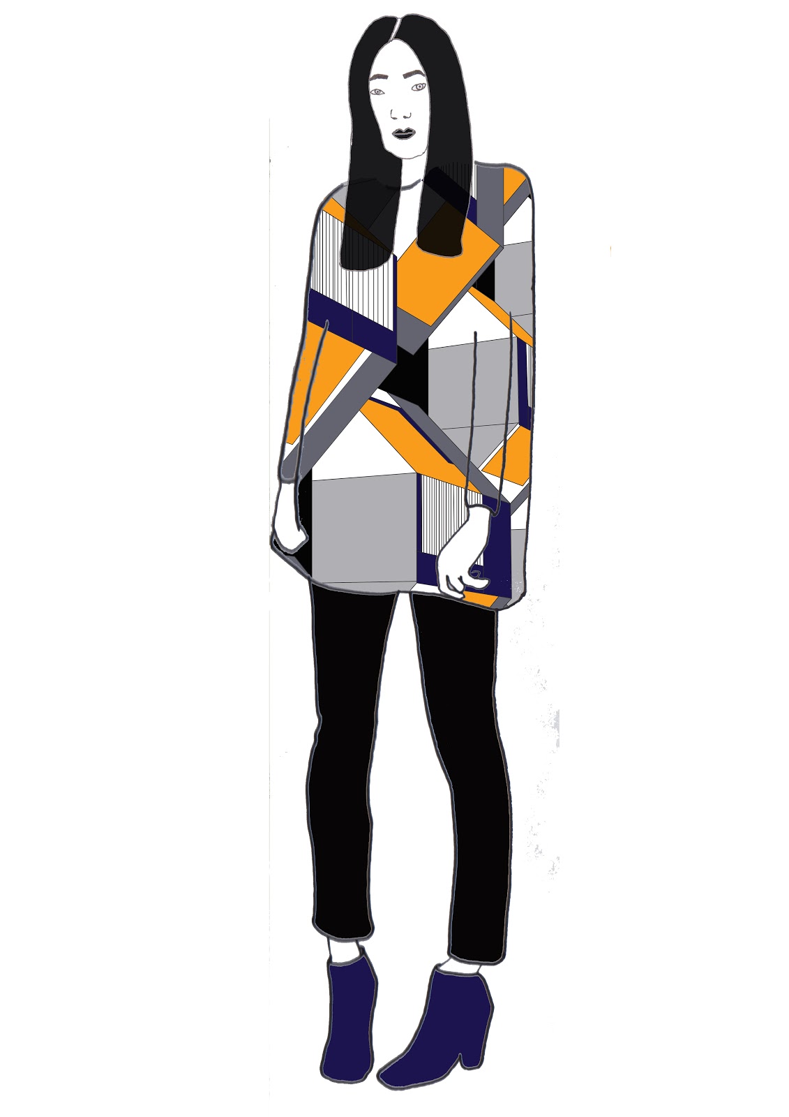
After doing drawing after drawing after drawing I have finally done some fashion illustrations that I am happy with. At first my face were horrible but I found a way round it and feel like the final outcome has really worked and that my illustrations suite my designs. Things that could have been done better are the eyes on the faces on the illustrations, also I need to work on drawing hands and feet. I can get the basic outlines right just on the details which is a bit of a let down for me.
I had a tutorial this morning and showed my tutor my illustrations that were different to these examples here.
I wasn't really happy with my work after the tutorial and this gave me motivation to improve my work and to really put all my effort into my designs so I have spent my full day drawing and redrawing my illustrations and redesigning my prints.


Final 6 Designs
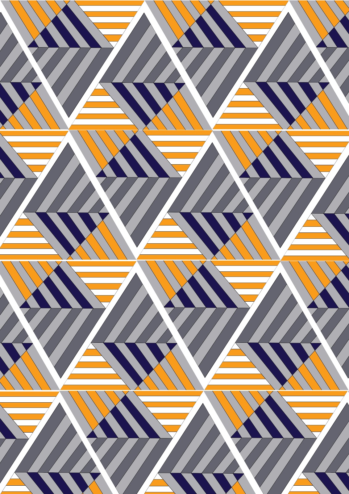
since developing my colour palette I have been able to progress with my designs and develop them using this chosen colour palette. I feel that the orange and blue combination give the prints a modern twist as well as the bold geometric shapes. I feel that my favourite design is the second one down as its interesting and bold, I feel that I would wear it myself. The design which I feel has not worked the best is the design with the hexagons, although it is in keeping with my theme it does not fit in with the rest as well as it possibly could and I feel that in the future I will improve upon this. The one thing I have been struggling with is who my customer is. I feel that she is bold and edgy and not afraid to be centre of attention. She can afford to buy one off pieces that can be warn once to make a statement.



Thursday, 8 November 2012
Colour Concepts
I have been asked to create a Mood Board, Colour Board and a Customer Profile Board. I am still really unsure of who my customer is at the moment so I am currently searching for a muse, someone who isn't afraid of graphic prints or colour, but still keeps their modern and sleek style. Here are a few examples of my boards so far.


Fashion Illustration
As part of the TD4F world it is important to know how to draw the human figure, and to be able to show our designs on this figure. So we had a illustration masterclass, the basics of it are quite simple - use a fashion magazine, find a model doing a simple pose and do a quick trace of the pose. This is such a simple way of creating an illustration and you can put your own twist on it! Also hair magazines are great for sketching faces and different hair styles. Personally I always struggle thinking of a different 'out there' hair style to put on my illustrations so this was a really useful tip that I took away from the day. I went straight out and bought a magazine and started to draw. Unfortunately some of my drawings were unsuccessful but this is what experimenting is about, learning your strengths and weaknesses and putting your strengths out there.


I tried to experiment with different medias throughout this process too, but I much prefer a good old pencil! Although some people can make their illustrations look amazing with different medias I'm a detail lover. I feel that my faces are definitely holding me back here and are something I vastly need to improve upon, but I know this and have been practising ever since. I find simple faces much easier for my style of drawing. Also I prefer shorter hair does or up-do's when creating my illustrations.
Shop Report
To help us understand how textiles within the fashion industry works and to learn more about trends and what is happening right now within the fashion world, we were sent to different shops to analyse everything from the clothes that were stocked, the price, materials used and what trends were popular in each store. My group were asked to go into Primark, Miss Selfridges, H&M, All Saints and Urban Outfitters. Personally I found this task really interesting as when I usually go shopping I realise that I dont really observe anything or take much of the shop in. Primark was really going for it with the Goth trend, using wet look materials and fake leathers. There was also a lot of studs going on in all stores apart from Urban Outfitters and All Saints. I feel that these two stores don't particularly stocks 'trends' they very much have their own look and tend to use basic silhouettes to portray them. Also Peplum tops are really popular within Primark, Miss Selfridges and H&M. The style is really complimentary to any figure and I imagine is a huge seller. Looking around these stores gave me inspiration towards my own project within TD4F as our end result must be a collection. As I want my prints to speak for themselves basic silhouettes such as a peplum top would work really well with the road that I am following at the moment.
Wednesday, 7 November 2012
Getting Technical
Technical drawings or 'flats' are really important within the fashion and textiles worlds as they show the garment to scale and show the technical details within the garment, something which a fashion illustration would not show. As I had never done this before I found it quit difficult and baffling at first to be honest! But with a bit of time and practice I feel that I have definitely got to grips with the skill and have been practising ever since. Basically we got a simple shirt, laid it out flat and then started to measure every detail of the shirt. We then divided the number by 5 and drew it onto the page. To help us with this we used equipment such as the Flexi Curve and a steel ruler. This took a while to complete so we decided to work in teams to speed the process up. Although when I got home I found it was easier for myself to concentrate when I was alone and had no one looking over my shoulder. I then went on to practice different garments such as a pair of jeans, and some dresses.


We started out by drawing our shirts free hand to see what the difference in quality and precision would be. I feel that between the above and below image there is a certain difference between the two.


TD4F
To move forward within the course we have now all been put into 4 different pathways or 'worlds' - Textiles Design for Fashion, Embroidery, Print and Knit & Weave. From my drawings the tutors decided that I would be best suited to TD4F and Print which I was really happy and excited about. Firstly I will be doing 6 weeks of Textiles Design for Fashion, which although fashion is in the name it is definitely more textiles based, I feel that this will be a perfect pathway for me as it combines two of my passions, I love mixing textiles with fashion as I am not very interior based and I am now excited to begin with the project.
Subscribe to:
Posts (Atom)