
Showing posts with label Trend. Show all posts
Showing posts with label Trend. Show all posts
Saturday, 22 February 2014
Web Resourse
So in the tutorial Alex mentioned that my work would look good as a web resource. At the beginning of the project I did mention that I would possibly make some sort of blog or Trend Tumblr to go along side the trend book. So I made a mock page of what it could look like. Something simplistic and sophisticated with a strong brand but imagery and colour that is easily changed for each season and trend.


Foil - Binding
I printed 10 pages of satin/gloss A3 in the A4 & more store for my trend book. I experimented previously with different types of paper and felt that this gave the most professional look. Unfortunately this paper cannot be double sided printed which is unfortunate but I didn't want to take away any quality by spray mounting the pages together, however this is something I will consider in future when planning to bind something as a book.


An upside to printing my trend book was that Nick from Book Binding kindly slotted me in to bind my trend book! He was really helpful and gave me loads of advice. I hope to get inducted into the Book Binding workshop as it gives that finishing touch to your work and think it would benefit me in my final year. We binded it with a simple bind of two screws with a greybeard from and back. I would have preferred it to be a more traditional bind but we did not have time. This is something I will keep in mind for next time.
An upside to printing my trend book was that Nick from Book Binding kindly slotted me in to bind my trend book! He was really helpful and gave me loads of advice. I hope to get inducted into the Book Binding workshop as it gives that finishing touch to your work and think it would benefit me in my final year. We binded it with a simple bind of two screws with a greybeard from and back. I would have preferred it to be a more traditional bind but we did not have time. This is something I will keep in mind for next time.
Prints
With my prints I didn't want to have any particular motif, more 'patterns'. I also did not want the prints to look like a collection, however I have created some colour ways as the whole point in creating prints for this project was to suggest how the trend could be translated in the trend book. I feel like they do represent 'Conceal/Reveal' and some of the print are quite in your face and some are more subdued. They are all digital prints as I wanted to use my digital skills within this project. If I was to produce these prints myself I would aim them at 20-30 year old women who want to add some colour to their workouts, without having to wear illumines clothing.


Sunday, 9 February 2014
Front Cover


Currently I am unsure as to have it landscape or portrait, however after experimenting on photoshop I feel that landscape will work better for me as this is how I am used to presenting my work and it allows for a better canvas for the information I plan to display.


Once I had came up with the idea of 'Foil' I started to play around with fonts, texture and layering. I took a photograph of some tin foil, slightly out of focus with my own Nikkor Lens. I then brought it into photoshop playing with the levels and contrast then inverting the colours to get the blue. The blue really stands out however I don't think its sophisticated enough for a trend book cover and would be more suitable as maybe a fashion magazine cover.


Also I looked at using different fonts, I want something that will stand out on the front cover and make an impact as although other trend books that I have looked at are very simple on the front I want mine to have visual impact from the start. I may play around with using tracing paper in the front cover, allowing that hidden texture underneath with a frosted top.
Friday, 7 February 2014
First Colour Palette
Today I have developed my first colour palette for the 'Conceal' half of my trend. Its quite a subdued palette, with a mixture of greys and blues, which will be quite a contrast to the 'Reveal' half of the trend. I hope to create two colour palettes for each 'Conceal & Reveal'. Firstly I just put the colours down not he page without thinking too much into it. Then on second glance I felt it lacked the sophistication that I want behind my work. So I took to the Pantone website to allow me to present my colour palette more successfully.

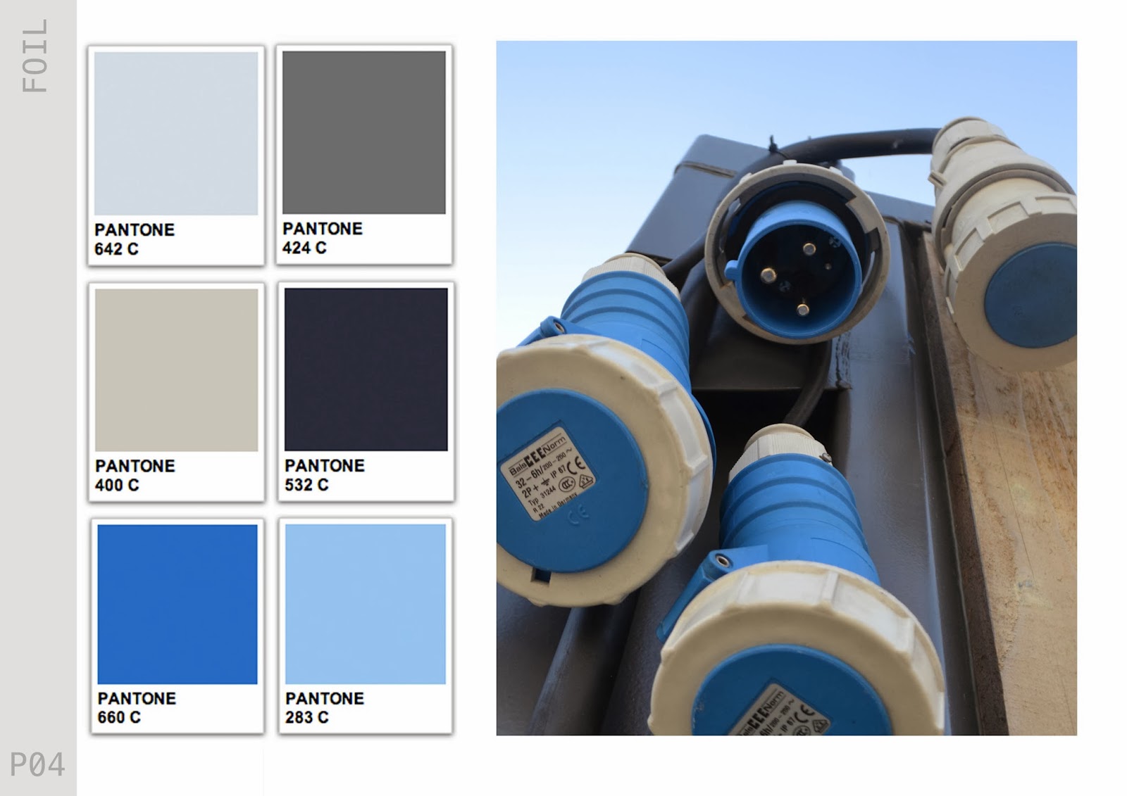
I thought more about the layout of the trend book and the uniformity of each page in this next image. I feel that once I create a basic layout it will be easy to transport all of the information into the pages. Also I may add more colours to the colour palette. Changes to the font need to be done too.
CONCEAL / REVEAL
After also thinking long and hard about the name for my trend and being told by Alex to be more 'pretentious'. I took to the online dictionary (again). I really liked my idea of 'hide and seek' but knew the phrase was too naive and not 'quirky' enough for a trend. I have looked at various websites WGSN and Vogue, to see what they name some of their trends, which are often a play on words, so this is definatley something I tried to and wanted to achieve.
Conceal/vReveal sums up my concept. Its a contradiction, yet compliments itself. I want the customer to know that there must be a juxtaposition within the trend, yet it is two things that are not usually put together. This also plays on my underlying concept around the idea of 'camoflage'. I am really happy with this name. My only regret is that I had come up with this earlier in the project.
Conceal/vReveal sums up my concept. Its a contradiction, yet compliments itself. I want the customer to know that there must be a juxtaposition within the trend, yet it is two things that are not usually put together. This also plays on my underlying concept around the idea of 'camoflage'. I am really happy with this name. My only regret is that I had come up with this earlier in the project.
FOIL
After endlessly looking for something to name my trend book I have found a name for my Trend Book FINALLY...
FOIL
foil 1 (foil)
I originally typed in 'contrast' into the online thesaurus and 'Foil' was on the list. I like the idea of just having one solid word. It has no particular meaning to me however when I then searched for the dictionary definition I thought that it linked quite well to my underlying 'camoflage' concept. I also think that my layout and front cover will now fall into place around this as now in my head I feel that I know how I want everything to look. However this could all change...
FOIL
foil 1 (foil)
tr.v.foiled, foil·ing, foils
2. To obscure or confuse (a trail or scent) so as to evade pursuers.I originally typed in 'contrast' into the online thesaurus and 'Foil' was on the list. I like the idea of just having one solid word. It has no particular meaning to me however when I then searched for the dictionary definition I thought that it linked quite well to my underlying 'camoflage' concept. I also think that my layout and front cover will now fall into place around this as now in my head I feel that I know how I want everything to look. However this could all change...
Tuesday, 4 February 2014
Mind Maps
I have been looking for the name for my trend book, so I have been using a great online resource called Visual Thesaurus, it brings up a mind map of everything that relates to the word you search for. In future projects I would like to become more decisive. Throughout this project I have learnt the importance of making decisions quickly and standing by them to build momentum early in the project.


Sunday, 2 February 2014
Camouflage
When I went to the Imperial War Museum today, they had a small section on camouflage, this caught my eye as I had previously spoke to Alex about including camouflage within my project. We came to the decision that this was not the best way forward for my project however. I have still been thinking about how to include an 'idea of camouflage' in my project. As we decided not to use the phrase 'industrial' in the project either, I have been thinking of more creative ways to describe my trend.
I thought of something along the lines of using my more 'urban' images as 'blending into our surroundings' and bringing in the sportswear theme to make us 'stand out in the crowd'. These two phrases juxtapose one another, and could be interesting. Although I don't think it will go down well in the tutorial as I have been quite inconsistent with my thought process. A name for the trend could be something like 'Hide & Seek' but maybe more poetic…….
I thought of something along the lines of using my more 'urban' images as 'blending into our surroundings' and bringing in the sportswear theme to make us 'stand out in the crowd'. These two phrases juxtapose one another, and could be interesting. Although I don't think it will go down well in the tutorial as I have been quite inconsistent with my thought process. A name for the trend could be something like 'Hide & Seek' but maybe more poetic…….
Salford Quay
So after discussing looking for more 'futuristic' and 'architectural' influences in my tutorial, I took a trip to Salford Quays and Media City. I have been there a few times but never really took much time to appreciate it. The area has some great pieces of architecture, particularly the Imperial War Museum and The Lowry. My earlier research has been mainly looking at small little things so it was good to get a wider perspective. The shapes and shadows that the buildings create are something I will use to influence my own design.


The time of day that I have taken these images is perfect. I have really been inspired by the colours and think I may have found my colour scheme. I am going to take these images into photoshop and create a more concrete colour theme for the project.


Fashion Unfolding
Alex suggested I look at this book. To be honest at first glance I was quite confused as to why he suggested this to me. However it does have some good visual sources of how sportswear is advertised, and how graphics is used in fashion. If anything I have learnt different ways in which I can present the 'translating trend' pages in my trend book. It also has some great examples of placement prints.
Tuesday, 28 January 2014
Tutorial 27/01/2014
Todays tutorial was more of a one on one due to unforeseen circumstances. I tried to use the to my advantage. Here are the points that Alex made today..
- Have more futuristic influences
- Change the name from 'industrial', it reads too hard. Needs to be more poetic
- Read 'Fashion Unfolding'
- Look into Nike / Adidas / other sports brands and how they illustrate their designs
- Search for a sportswear Live Project
- Look into lulu lemon.com
- Try gather more architectural influences, such as Frank Gehry
- Visit the Imperial War Museum in Salford Quays
I feel a lot more clear headed after the tutorial. I have a mental list, and just need to go through it and tick everything off. I feel that if I work flat out from now till the deadline I will have a project I can be proud of.
Sunday, 26 January 2014
Concept Page
I have started to develop my Trend Book,(although I still do not have a name for the book or the trend!). I have interpreted the 'Distilled' trend in my own way and incorporated it into the styling of the book. Aesthetically I am pleased with the direction the book is going but I feel that I can push myself further and make it more exciting.


I'm still undecided on whether to make the trend book portrait or landscape, these are a few things I want to discuss with Alex in my tutorial tomorrow. I have written a list of topics I want to cover in the tutorial to fully use the small amount of time that we get to my advantage (hopefully).
Subscribe to:
Posts (Atom)