Wednesday, 14 November 2012

Inspiration

Throughout this project I have learnt the importance of research and inspiration. Looking through websites such as Vogue.com has helped me to stay on track and to develop and challenge myself in my work. I have put together some images that I feel relate well to my work.


 Stella McCartney has used a similar colour story here, using a bold orange as a statement colour were as I have tried to keep my bold colour as more of an accent colour within the collection.

 As soon as I saw this piece from the SS13 collection from Fendi I immediately saw a connection between that and my own work, the graphic print on top with a more simplistic basic colour below. The print is so graphic it almost feels like it is coming off the fabric which is something that I feel I have achieved within my own work.


Monday, 12 November 2012

Fashion Illustrations

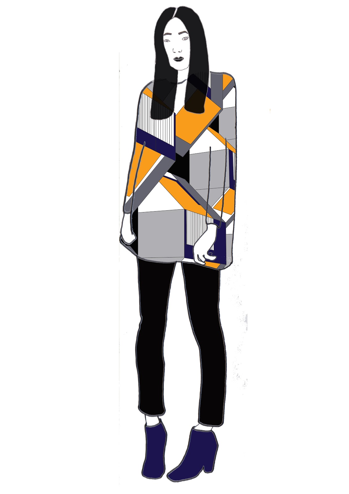
After doing drawing after drawing after drawing I have finally done some fashion illustrations that I am happy with. At first my face were horrible but I found a way round it and feel like the final outcome has really worked and that my illustrations suite my designs. Things that could have been done better are the eyes on the faces on the illustrations, also I need to work on drawing hands and feet. I can get the basic outlines right just on the details which is a bit of a let down for me.

I had a tutorial this morning and showed my tutor my illustrations that were different to these examples here.
I wasn't really happy with my work after the tutorial and this gave me motivation to improve my work and to really put all my effort into my designs so I have spent my full day drawing and redrawing my illustrations and redesigning my prints.


Final 6 Designs


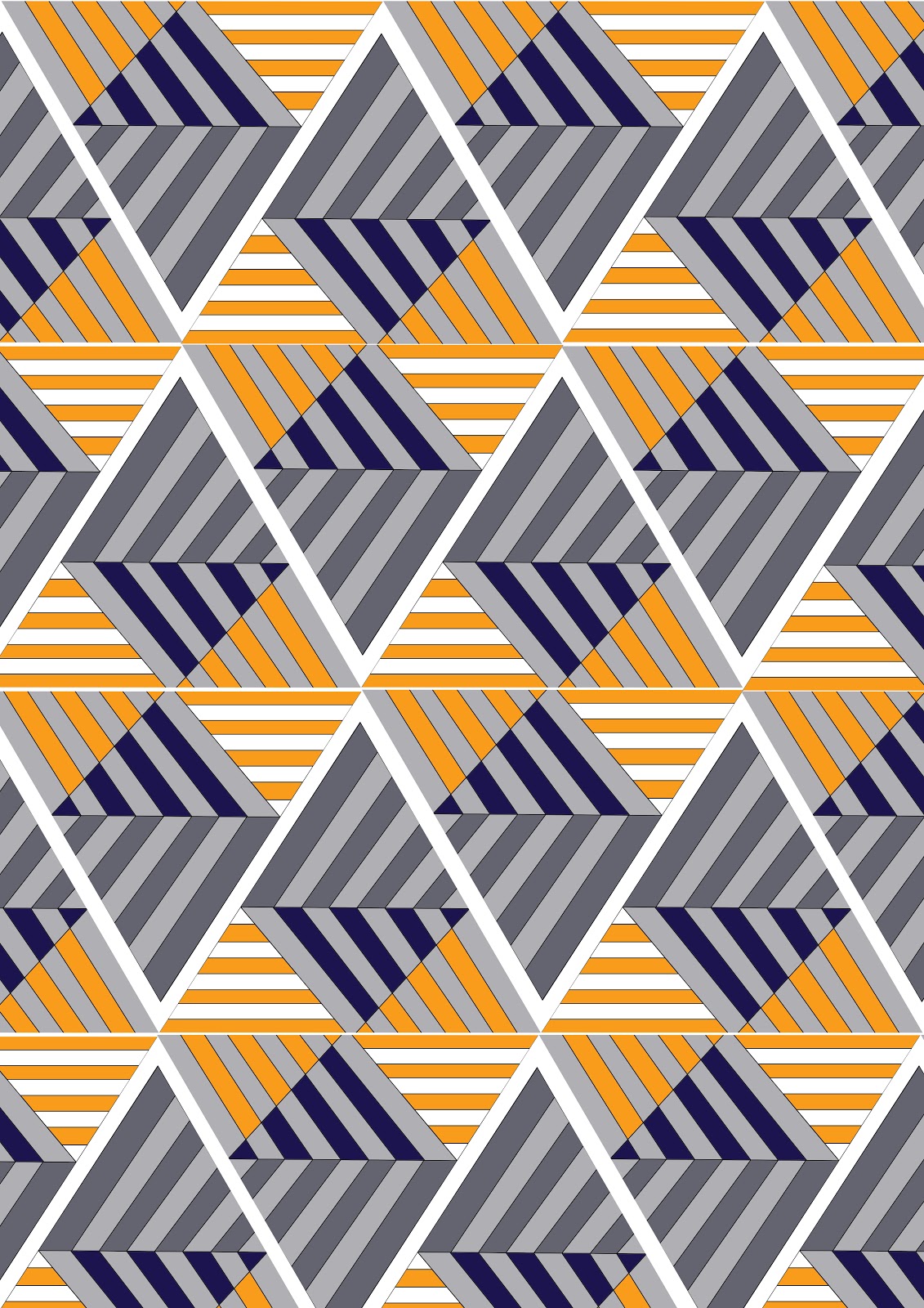
since developing my colour palette I have been able to progress with my designs and develop them using this chosen colour palette. I feel that the orange and blue combination give the prints a modern twist as well as the bold geometric shapes. I feel that my favourite design is the second one down as its interesting and bold, I feel that I would wear it myself. The design which I feel has not worked the best is the design with the hexagons, although it is in keeping with my theme it does not fit in with the rest as well as it possibly could and I feel that in the future I will improve upon this. The one thing I have been struggling with is who my customer is. I feel that she is bold and edgy and not afraid to be centre of attention. She can afford to buy one off pieces that can be warn once to make a statement.


Thursday, 8 November 2012

Colour Concepts

I have been asked to create a Mood Board, Colour Board and a Customer Profile Board. I am still really unsure of who my customer is at the moment so I am currently searching for a muse, someone who isn't afraid of graphic prints or colour, but still keeps their modern and sleek style. Here are a few examples of my boards so far.


Experimentation


Basically I found an image that I loved and tried to draw it.. unsuccessfully!!! So I took the image into Illustrator so that I could get the lines right and add colour into the image.. I love it! Although the design is quite graphic which is not usually my style I really like it. I'm still unsure of the colour but I feel that the orange gives the image a modern aesthetic.

Messing with Multiples

Photoshop has became my best friend over these past few days as I received quite a bad tutorial the other day. But it was exactly what I needed to jump start my motivation levels again! I feel like I was stuck in a rut a little, not getting out of my flat to become inspired and just browsing blogs for secondary sources rather than getting out there and creating my own.

However I have began using my drawings and developing them into prints using a range of colour-ways. I think I may have came up with a definite colour scheme but I am still a little unsure. As part of this project is to come up with a Customer Profile, Mood Board and a Colour Board I feel it is important to develop my drawings to have a greater understanding of who would wear them.


Throughout my experimentation with this drawing I felt that the bright colours were not me and did not represent my aesthetic. My tutor suggested adding an accent colour of ed but when I have tried this I really do not feel like it works very well and dates the geometric, modern shape. I also tried having the background in red to make it more vibrant but that did not work either. In the future I plan to experiment with different colour ways to give the pattern a much more modern feel to match the modern shape. Although I do like the grey scale and feel that a accent colour would compliment it really well, its just a matter of experimentation. I also feel that this print works better as a placement print than a repeat pattern.

Fashion Illustration

As part of the TD4F world it is important to know how to draw the human figure, and to be able to show our designs on this figure. So we had a illustration masterclass, the basics of it are quite simple - use a fashion magazine, find a model doing a simple pose and do a quick trace of the pose. This is such a simple way of creating an illustration and you can put your own twist on it! Also hair magazines are great for sketching faces and different hair styles. Personally I always struggle thinking of a different 'out there' hair style to put on my illustrations so this was a really useful tip that I took away from the day. I went straight out and bought a magazine and started to draw. Unfortunately some of my drawings were unsuccessful but this is what experimenting is about, learning your strengths and weaknesses and putting your strengths out there.


I tried to experiment with different medias throughout this process too, but I much prefer a good old pencil! Although some people can make their illustrations look amazing with different medias I'm a detail lover. I feel that my faces are definitely holding me back here and are something I vastly need to improve upon, but I know this and have been practising ever since. I find simple faces much easier for my style of drawing. Also I prefer shorter hair does or up-do's when creating my illustrations.