Friday 31 January 2014

I went for a walk around the Northern Quarter to gather some more inspiration and went into the Manchester Arts & Craft Centre, it had some really interesting artists studios, one that caught my eye was 'Sausage Dog' by Harriet Godden. I loved that you can see the artists at work in their studios as well, some of the work was amazing and looked like something I would enjoy doing after uni. I might contact some of the artists who rent studios there to see if I could gain some work experience from them.

I also went into 'Magma' one of my favourite stores in the Northern Quarter, it gave me a little inspiration towards what the front cover of my trend book could look like.


Tuesday 28 January 2014

Tutorial 27/01/2014

Todays tutorial was more of a one on one due to unforeseen circumstances. I tried to use the to my advantage. Here are the points that Alex made today..


  • Have more futuristic influences
  • Change the name from 'industrial', it reads too hard. Needs to be more poetic
  • Read 'Fashion Unfolding'
  • Look into Nike / Adidas / other sports brands and how they illustrate their designs
  • Search for a sportswear Live Project
  • Look into lulu lemon.com
  • Try gather more architectural influences, such as Frank Gehry
  • Visit the Imperial War Museum in Salford Quays
I feel a lot more clear headed after the tutorial. I have a mental list, and just need to go through it and tick everything off. I feel that if I work flat out from now till the deadline I will have a project I can be proud of.

Sunday 26 January 2014

Concept Page

I have started to develop my Trend Book,(although I still do not have a name for the book or the trend!). I have interpreted the 'Distilled' trend in my own way and incorporated it into the styling of the book. Aesthetically I am pleased with the direction the book is going but I feel that I can push myself further and make it more exciting.


I'm still undecided on whether to make the trend book portrait or landscape, these are a few things I want to discuss with Alex in my tutorial tomorrow. I have written a list of topics I want to cover in the tutorial to fully use the small amount of time that we get to my advantage (hopefully). 

WGSN

WGSN has been a huge inspiration throughout this project. I have been referring to this website whilst trying to figure a layout for my trend book as I really like the aesthetic of site. Whilst looking through the website I spotted one of their predicted upcoming trends 'Distilled' it's about using abstract camouflage which gave me an idea of 'urban camouflage'. So I have started to use my own imagery to create this style. I plan to incorporate this within either my own trends or within the layout of my trend book.


Saturday 25 January 2014

Work Experience

I have found it really difficult to find work experience opportunities, or to be accepted for them once applied for. It has been really frustrating as it is hard to balance my time between uni work and developing my CV. I have used LinkedIn and my email account to mainly contact people. Here is some evidence of my searching for work experiance.


Live Trace with Adobe Illustrator

On thursday I went to one of Alex's Digital Workshops as I feel it is important to learn as many skills as possible throughout my time on this course (and I said I would do so in my brief). Especially with my project at the moment being very intensively digital based. I feel quite confident on Photoshop however Illustrator is my weakness so this is my main reason for attending.


Here is a screen shot of part of the process. The effect it has on photographs rather than hand drawn imagery really intrigues me, I think it looks quite similar to the effect I was trying to create through my Intentions unit.

Composition

Composition is a key element to my trend book. The layout is something that has to spark inspiration so it is important that the composition is perfect. When I looked at Promostyl, I felt that the pages were very cluttered. My style is more simplistic. I want to choose specific imagery to hint at my trends. Here are a few examples of my first compositions for my trend books. These would be used as pages to show my 'Industrial' part of the trend, these would be followed by Colour charts, fabric samples and my own illustrations to demonstrate how the trend could be interpreted.


Tuesday 21 January 2014

Opposites

I have been trying to think of what the opposite of 'industrial' is for a while now. I feel that my Trend Book cannot start to take shape until I am fully decided on these two things and then I can go straight ahead with it. Going around the city and taking photos of things to do with 'Industrial' has been quite fun, I am planning on going to the MOSI tomorrow to source some more inspiration from a source that I did not consider when first writing my brief.

Once I find this second source of inspiration I hope to feel ore involved within my own project and hopefully a lot more motivated than I currently am. However this being said I am determined not to give in and conform to just designing another print collection as I feel that stepping out of my comfort zone is essential to my progress within Textiles.

Industrial/ Domestic

Domestic: 
- relating to the running of a home or to family relations:
of or for use in the home rather than in an industrial or office environment:
-(of an animal) tame and kept by humans
-(of a person) fond of family life and running a home:

After taking inspiration from Karen Nicol I went more into depth with the definitions of the words I was looking at. I then went onto looking at the opposites of these word. I eventually came up with 'Industrial & Domestic'. I have put two minds maps together to show my thoughts so far.


Spring 2014 Couture

I have been keeping up to date with Paris Couture Fashion week just to keep upto date with any current trends and I think it is important to keep up to date with current trends as well as upcoming trends for this project. Something which caught my eye was the Christian Dior collection, it had some structured elements running throughout with a feminine twist.

The result was an all-white, womblike space, inspired by the work of Valentine Schlegel, a little-known ceramist from the fifties who graduated to making "architectural suggestions" with biomorphic plaster jobs. To Simons, the interior represented "a radical, female gesture." 


Monday 20 January 2014

Live Project - Bradford Textile Society


Fashion Garment Textiles:

ASSOCIATION OF FASHION & TEXTILE COURSES AWARD:
-
A fashion fabric, which may include a combination of processes, including embroidery, designed for a specific outfit or garment collection.
- Fashion illustration of proposed garments should be included.
AWARDS: £250 1st Prize / £150 2nd Prize / £100 3rd Prize 

As creating a trend book and a collection is going to take a lot of time throughout this project I have decided to choose the Bradford Textile Society live brief as I can enter some of the designs that I will create in this project. I am also really interested in the Nike Club to Club brief however I do not feel that I will have the time at the moment, especially if I manage to get a work experience. However I will keep unto date with live project and competitions from now on as it's a great way to get involved.

Saturday 18 January 2014

Promostyl

Researching into different trend books has been a major help especially when taking into consideration the content and composition of my own trend book. I want it to look different to any of the others that I have looked at, and all of the content is mainly going to my my own primary research so it will be a challenge. I'm very happy that I have taken myself out of my comfort zone and over the next two weeks I would like to get my first 5 pages complete.


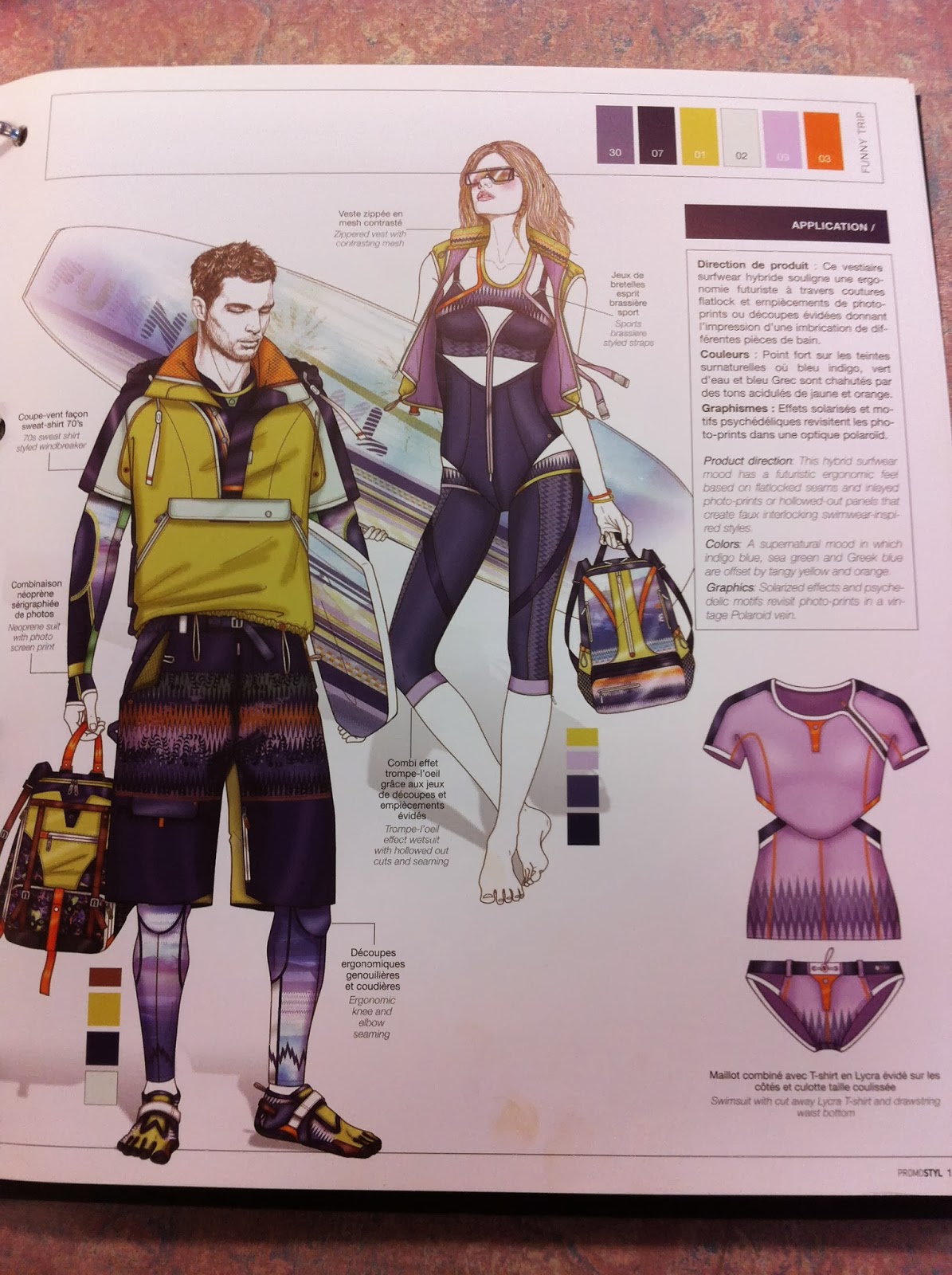
The fold out page in Promostyl is quite interesting and adds a different dynamic to the book. I would like to add a little extra something to my own trend book to give it a little edge. This could possibly be a more interactive page with fabric swatches available.


 Including Contents Pages and Information pages had not crossed my mind until I looked through some trend books that are currently on the market. It will allow me to give a brief over view to my customer of what I foresee happening within future trends. However I would like to do this in a more visual way. There will still be explanations but more visuals for the customer to view.


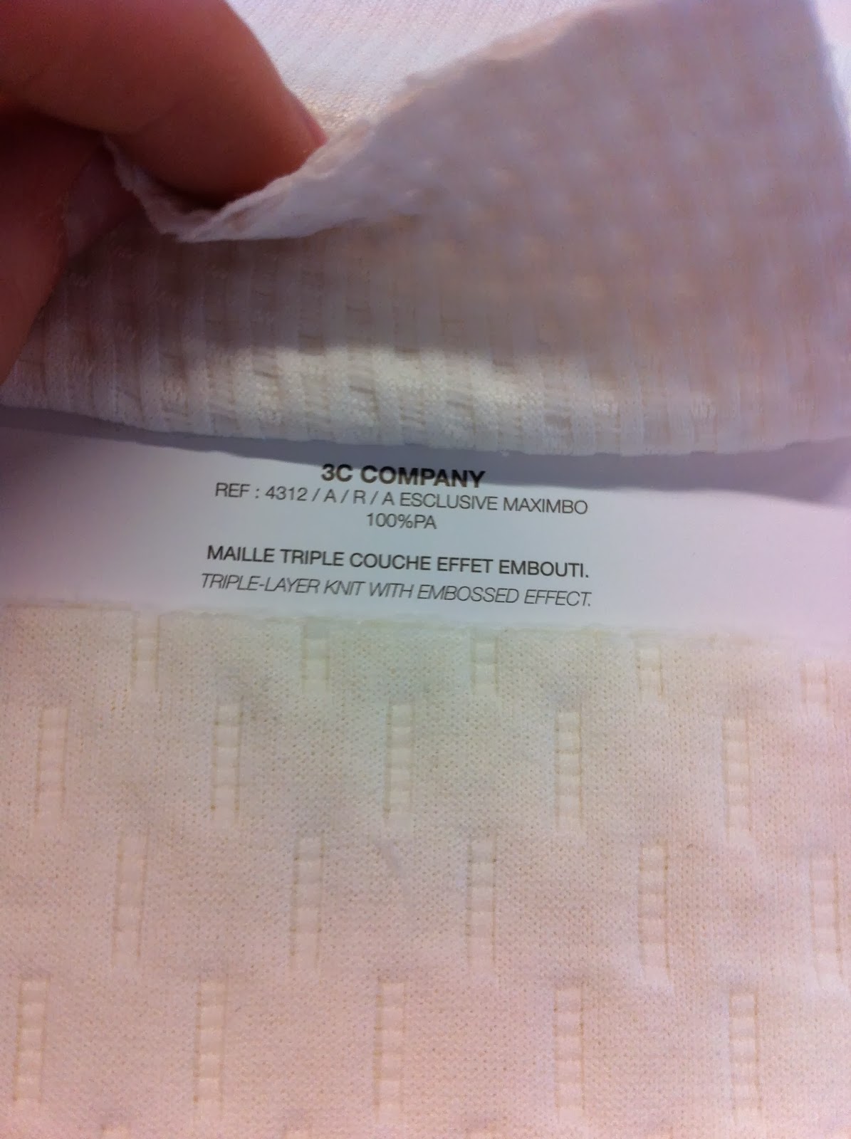
 The real fabric swatches and descriptions is something that has really stood out for me. I will include this within my own trend book as it makes the book more tactile and introduces my love for fabrics. I look forward to going into fabric stores and searching for the right shade and tone materials in the next few weeks.


At the back of Promostyl there is a little pocket with two lots of swatches. The first is colour swatches and the second is fabric swatches. The fabric swatches represent the colours that Promostyl have chosen, but the fabric are a lot cheaper than those that they have chosen to present. The colour swatches are a really good idea, all the names of the colours are on the front label so it is easy for the customer to know what they want after looking through the trend book. This is something I have taken on board and also plan to include within my own trend book.


Further Research

After my tutorial on monday I wanted to gather some more research around the idea of 'industrial' so I just went around my area of where I live to gather a few images. I think I need to broaden the area which I am looking at. I believe this images are not as 'industrial' as I would like so I need to exhaust all resources to accomplish a more defined concept they are more 'urban'. Here are some of my favourite images from the day.


Thursday 16 January 2014

Karen Nicol

Today our guest lecturer was Karen Nicol, she is a Textile designer who is an embellisher. She was really enthusiastic and had done a lot of work, she probably had the most work between all the freelancers we had had in to speak to us. I was quite inspired by her as her work was really interesting and unique, and she has worked with a lot of fashion labels such as Givenchy, Chanel, John Rocha, Julian McDonald, Matthew Williamson, Chloe and Marc Jacobs. She really went into the nitty gritty about working for these people. Saying she could have only 6 hours to make something that would be shown the next day. She kept her design simple so that they could be made quickly. Also her price needed to be kept down, if something was embellished for £150 it would immediately be sold for £420!!! Also she told us how she gets a lot of inspiration from dictionary definitions which is quite interesting.

Secondary Research

Thinking again about the industrial vs feminine idea I have used images from secondary sources to visualise the idea.
 vs


vs     

vs