Saturday 22 February 2014

Final Evaluation

At the beginning of the Locating unit I was really motivated and eager to get started as the brief that I had set myself was really broad and open for experimentation. In one of my first blog posts I write about how I want to improve on the Intentions unit and work flat out from the start, as this was one of the negative comments from my previous feedback. I believe that I have committed to this statement, as I thought I may struggle to self motivate but I feel that by coming into university and seeing how inspired everyone else around me is and taking myself out of my home environment has really helped throughout this unit and I plan to continue with this pattern in Unit X.  In my brief I written that I 
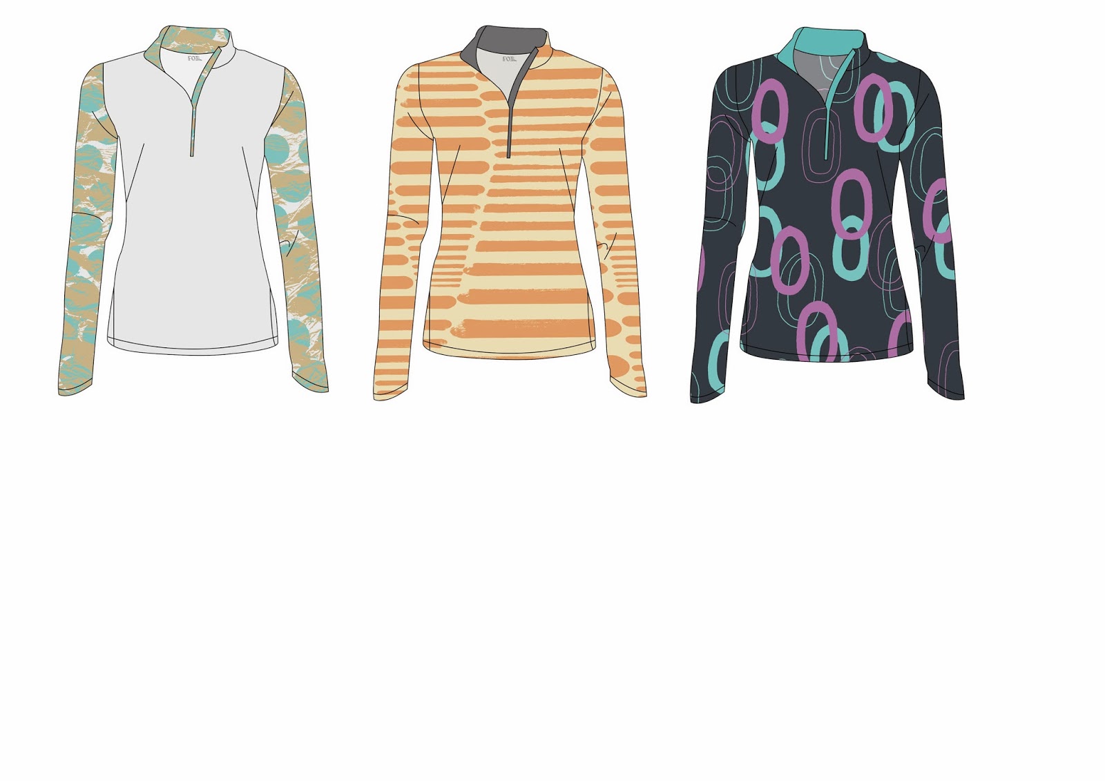
would like to create a trend book, based on a trend that I had developed myself and then design a print collection based upon the trend. I have completely stuck to my brief, I thought it would be very difficult to do and time would not be on my side, however my time management skills have increased and this has been beneficial.

My work level has been consistent throughout. However I am quite disappointed in how I have handled my time when considering live projects, as I wish I could have completed a more in depth brief or something a bit different to what I was doing. In the next unit I will search for my own live projects and push myself with this to test my abilities on balancing more than one project at a time.

Something that I feel has really improved in this unit is my ability to research, and the outlets I use to do so. In the past I have tended to just use online recourses to do my research, however this term I have taken to the library and read quite a few books on trend forecasting and how graphics are used in fashion, also I have looked at Promostyl a lot in the journal section. I have found some of these books more helpful than I would a website. Although this being said I have really enjoyed exploring WGSN, which has been a huge inspiration throughout this brief. In my brief I have written about attending workshops and learning more digital skills, I have not been able to attend as many of the workshops as I would have liked however I have kept up to date with all of the hand outs and taught myself following these.

Within this unit we have also been asked to look for work experience within the ‘outside world’ I have been disappointed with the lack of feedback from emails that I have sent. It has been quite a challenge to keep motivated about this especially when others on the course have received more than one. However I have been able to construct a CV that I am proud to send to companies and a basic Covering letter format too. These are key so I can carry on throughout the next project and hope to get a placement over summer. One of the things I would change is to maybe have more pages on my finished trend book, and I wish I had gotten inducted to the book binging workshop to have a more functional bind on the book, I plan to do this before unit x as I think it would be useful. 

Overall I feel that this project has been really successful and I am very happy with the results. I feel that my trend book looks very professional and I spent a lot of time perfecting it to that standard. This project has also given me an insight into what I would like to do in the future. I have came out of my comfort zone and liked what I have found! Trend forecasting is definitely for me and I am looking forward to delving further into this within Unit X. Something I would like to improve upon is my designing skills. I need to experiment more with media and carry out more drawing to create a different range of designs. However I do feel that I have concreted the decision that my work belongs in the fashion world.

Work Experience

I have been quite unlucky with work experiences this term. I have really tried and refined my CV a lot, emailed a lot of people but just no luck. This is not going to deter me though and I will keep trying. I am looking forward to Unit X as we get to work with outside influences so this could help add some more experience to my CV. I have started to contact trend focused companies and magazines too, as this project has made me realise I love trend forecasting and styling as well as designing for fashion, so I would like some experience in these areas. Here is a link to my LinkedIn profile too.

http://lnkd.in/bvP__9k


Web Resourse

So in the tutorial Alex mentioned that my work would look good as a web resource. At the beginning of the project I did mention that I would possibly make some sort of blog or Trend Tumblr to go along side the trend book. So I made a mock page of what it could look like. Something simplistic and sophisticated with a strong brand but imagery and colour that is easily changed for each season and trend.


Live Project Finished

This is the design that I have decided to enter into the Bradford Textile Society. It has stood out to me throughout this project and I love that I have done a placement print that I'm really happy with. I thick it's sophisticated and the colours compliment one another. I would like to look at more competitions through the feedback and assessment weeks to keep myself designing and not stopping as I feel this slows my momentum of working down.


Foil - Final Pages


Foil - Binding

I printed 10 pages of satin/gloss A3 in the A4 & more store for my trend book. I experimented previously with different types of paper and felt that this gave the most professional look. Unfortunately this paper cannot be double sided printed which is unfortunate but I didn't want to take away any quality by spray mounting the pages together, however this is something I will consider in future when planning to bind something as a book.

An upside to printing my trend book was that Nick from Book Binding kindly slotted me in to bind my trend book! He was really helpful and gave me loads of advice. I hope to get inducted into the Book Binding workshop as it gives that finishing touch to your work and think it would benefit me in my final year. We binded it with a simple bind of two screws with a greybeard from and back. I would have preferred it to be a more traditional bind but we did not have time. This is something I will keep in mind for next time.


Prints

With my prints I didn't want to have any particular motif, more 'patterns'. I also did not want the prints to look like a collection, however I have created some colour ways as the whole point in creating prints for this project was to suggest how the trend could be translated in the trend book. I feel like they do represent 'Conceal/Reveal' and some of the print are quite in your face and some are more subdued. They are all digital prints as I wanted to use my digital skills within this project. If I was to produce these prints myself I would aim them at 20-30 year old women who want to add some colour to their workouts, without having to wear illumines clothing.


Garment Flats

I haven't drawn technical flats since the beginning of first year so it was fun to revisit this. I'm not happy with the hand drawn ones so have taken them into Illustrator to give them an update.


 Alex suggested I add the 'foil' label to my flats, and to give them a more realistic feel by changing the opacity at the back, which I hadn't thought about but they look 100% times better now.
 I experimented with different types of garments, vests, leggings and jumpers. I plan to also look at swimwear too. I like the different placements that I can use with the jumper and feel that the flats look quite professional.


Tutorial 17/02/2014

In this tutorial we covered any last worries and everything that we need to present/submit on deadline day. Some of the things Alex had to say - 

- Add 'Foil' labels to any flats
- Only use the front of the garment flats
- 'Foil' could be more of a digital resource due to lack of fabric
- Add photos of fabric rather than actual fabric
- Not to worry about quality of print (for now) just simply bind the trend book
- Layout more important
- Reference any secondary sources

I didn't really have much to ask in this final tutorial as I pretty much knew what needed to be done, it was just a question of actually doing it. It was good to hear everyone else's questions though, and to see at what point everyone else was at so I didn't worry too much.

Saturday 15 February 2014

Displacement Mapping

I didn't happen to make it to the Displace Mapping workshop, but printed off the sheets and taught myself it. This is from my first attempt (not that good) but I think in time and with some more practice this could work well in other projects. However in this project I do not need to put my work onto real people as a trend book is just and idea of something.


Friday 14 February 2014

Daniel Heath

Todays lecture has been one of my favourite so far. Daniel Heath was really interesting and had some great advice for us. He even came back to the studio and we had an invaluable conversation that we were all grateful for. He gave us advice on always taking high quality images of our work and keeping up to date with it as it is important that you always have images to hand to show prospect customers and press interests. This also makes it easier for the press and they are more likely to give you more coverage.

Daniel Heath for Heals
He also told us the importance of getting your name out there, and the fact that every project may not be lucrative but they can always lead to more work which is always a bonus. Also about the production of 'gateway products' such as cushions. If someone buys one of your cushions they are more likely to buy a mirror to match or the wallpaper that is also part of that collection.

Daniel Heath for Retrouvius


Freelance design has never crossed my mind however the idea of a more 'organic journey' after university rather than working for someone sounds amazing. Being able to design for yourself without restriction and controlling which jobs you do and do not do. However the most important advice I feel he gave us was BE PROACTIVE, NOT REACTIVE.


Tutorial 10/02/2014

I felt really confident going into this tutorial as my vision for this project has really came together. I have a solid layout for my trend book, a name, and a name for the trend. Which is a lot more than I have had for a while. Alex really liked my ideas for the cover, to use tracing paper and acetate to divide the trend book to make it more visual for the audience. However he did discuss with me that he felt I have been putting off drawing and that I use my digital work as a comfort blanket. I do have to agree with this statement. I know that digital work is my strength and I love doing it. Sometimes this can distract me from what truly needs to be done. In the next project I will take this on board.

Next Week
- Have plan for presentation boards
- Have the majority of the project complete
- Visit Leons in Chorlton for a wider fabric selection.

Submission
- Have 2/3 boards that show development through the course
- Bring final brief
- Board for live projects
- Memory stick submission is possible

Sunday 9 February 2014

Stella McCartney for Adidas

Stella McCartney designed a range of gym wear for Adidas, the designer says that her whole collection although based upon sustainable textiles, was more about making the women wearing it feel good. She had spoken to top athletes and even they had said that they feel like they work better when they feel tat they look good. I love the futuristic feel behind her designs and how wearable the designs are. I want to keep this consistent with my own designs.

"I want to inspire women to get their sweat on. We work with top athletes,and even they tell me they perform better when they feel like they look good. It's a confidence thing." Stella McCartney


Front Cover


Currently I am unsure as to have it landscape or portrait, however after experimenting on photoshop I feel that landscape will work better for me as this is how I am used to presenting my work and it allows for a better canvas for the information I plan to display.

 Once I had came up with the idea of 'Foil' I started to play around with fonts, texture and layering. I took a photograph of some tin foil, slightly out of focus with my own Nikkor Lens. I then brought it into photoshop playing with the levels and contrast then inverting the colours to get the blue. The blue really stands out however I don't think its sophisticated enough for a trend book cover and would be more suitable as maybe a fashion magazine cover.


Also I looked at using different fonts, I want something that will stand out on the front cover and make an impact as although other trend books that I have looked at are very simple on the front I want mine to have visual impact from the start. I may play around with using tracing paper in the front cover, allowing that hidden texture underneath with a frosted top.


Friday 7 February 2014

Fabric

After emailing a lot of companies about ports wear fabrics, I finally got some small samples through the post today. At first I hated the colours but worked out that placing them together in different ways can work well. I particularly like the black sports mesh.


First Colour Palette

Today I have developed my first colour palette for the 'Conceal' half of my trend. Its quite a subdued palette, with a mixture of greys and blues, which will be quite a contrast to the 'Reveal' half of the trend. I hope to create two colour palettes for each 'Conceal & Reveal'. Firstly I just put the colours down not he page without thinking too much into it. Then on second glance I felt it lacked the sophistication that I want behind my work. So I took to the Pantone website to allow me to present my colour palette more successfully.

I thought more about the layout of the trend book and the uniformity of each page in this next image. I feel that once I create a basic layout it will be easy to transport all of the information into the pages. Also I may add more colours to the colour palette. Changes to the font need to be done too.