Sunday 24 November 2013

Intentions Unit Evaluation

Throughout my first few weeks within the 'Urban Influences' brief I found it quite difficult to find any inspiration, however I found that the key to this was to research, research and more research! I went out with my camera and photographed everything I found interesting to gather primary research for myself. This was the best thing I could have done as I then developed my colour palette from these images as well as my final concept. I began to look at more industrialised Manchester, the nitty gritty rather than just architecture. Throughout the project I have even taken some of these photographs into Photoshop, enhanced and manipulated them to use as backgrounds for my designs. Drawing was another major aspect of the process for this project, the more drawings the better is what I have learnt, as in the beginning I just was not producing enough work. Once I started to take the drawings into Photoshop and create brushes with them I started to find my inspiration. Also developing my customer profile allowed me to design for an audience and I referred to this often to make sure I was on the right track.

Something that I have learnt throughout this project is that you should never stop developing your work, there is always room for improvement. Researching other designers and practitioners constantly throughout the project has also helped me as it has allowed me to maintain my motivation and inspiration and pushed me to progress my skills. I work best this way. Also I have began to make it a habit to get up and go into the studio to work rather than in my room, as the communication with other students and seeing there work allows me to push myself even further and I get a good quantity of work produced this way. Also as soon as I get home from uni I complete my checklist I have set myself while I am still in the right frame of mind.

After being told we most take risks and experiment I decided it was time to tackle the print room again although it is not my favourite place. However after a few stressful hours it just confirmed that the print room is not for me and that I much prefer digital printing. This project has allowed me to discover myself more as an artist, I know what audience I want to design for and I have a stronger aesthetic than in first year. The quality of my work has stepped up and has more depth. Something I would like to change about the project is possibly my over all collection, I feel that they could have been a lot more cohesive however I have experienced with colour and the levels of colour within each design, rather than sticking to the same formula in each design.

This project has concreted my decision that I am a Textiles Design for Fashion student and this is definitely what I want to pursue further in my career. I am thoroughly looking forward to the next project and possibly getting a placement over the next few weeks to develop the numerous skills that I have learnt in this project further. During the net few weeks I am going to make the most of our time off to concentrate on my CV and applying for placements as I would like to gather as much experience as I possibly can. I am also pleased that I have managed to attend some of the digital and print workshops on offer this term as it has allowed me to learn and develop my craft, this is something I will bare in mind next term and try to attend even more as knowledge is a strong skill to have.

Antipodium

Throughout this project I have been constantly looking for more inspiration and research into a variety of companies. Antipodium is a design house which stood out to me the most, I had never really bothered to look at their work till recently. I felt a strong connection to their work as their customer is the same market that I am aiming my own design towards. A bold, sophisticated and young woman who is not afraid to make a statement. The cut of their clothes is simple but the design is bold, along with their colour palette. Also I noticed some of their inspirations for their most recent collection where similar to my own, looking at CCTV as part of my urban influences brief their new collection is actually called 'Sex, Lies & CCTV'.


Fabric Samples

My final designs have been taken to digital print. I chose Crepe De Chine as it was light, kept the colour vibrancy but also remained looking expensive and sheer. The outcome of my designs on this fabric is amazing, I love the finish of the design and has made me feel a lot better about this project as a whole. Putting my designs onto fabric has really put my work into context and I could see the prints as an actual fashion fabric, rather than just a 2D design on photoshop. Although I have experimented in the print room with fabrics I feel that using digital print was definitely the best decision for myself and my designs. This has also allowed me to view my work as a collection rather than a group of designs.


Friday 22 November 2013

Concept/ Context


These are my final boards which represent my brief, showing my concept, the context and the results of my process. I will not present all of these boards in my area on the day of submission as I do not want to over load it. So some of these boards will be simply presented along side my sketchbooks. I am really pleased with the outcome of these boards as I feel they are cohesive and put my concept across well. For my main illustration board I chose my three favourite prints from my collection and really tried to work on the styling of my illustrations.


Final Prints

These are my final designs from this project. I am quite happy with the end result especially when I compare them to my first designs. The colour palette I have used works really well together and I feel has been used evenly throughout the designs. Also looking through my initial drawings and ideas, I feel that these designs are a reflection of my initial ideas and primary research. Using this amount of colour has definitely been a learning curve for me, as I was quite scared to used colour, so this has been quite a risk for me.


Thursday 21 November 2013

Who is my Customer?

I have been thinking a lot about who my customer is. My customer is a bold, sophisticated young women who is very active and loves to travel. She loves fashion and has a distinct eclectic style. My customer is a 20 something who likes to mix high street with high end.

To please this customer I think it is key to keep my designs looking fresh and expensive but with a modern element. My colour palette is quite bold and vibrant so I think that this would catch my customers eye.


Tuesday 19 November 2013

Adding Designs into Illustrations

After teaching myself how to use layer masking, I have been referring to my technical notes a lot and using this technique with my new illustrations. There are a few things that can be tweaked, other than that I am very happy with this design. I see my designs working more as placement prints or using certain areas of one particular design as apposed to a full ' all over ' print. I have also tried to work on my style like Alex asked in previous tutorials, and I feel that looking back at my original illustration that this is a vast improvement.


More Illustrations


I have been experimenting a lot with my illustrations. To try and develop my own style and see what kind of illustration I wanted to use, I tried to create a range. I used Street Style blogs to find different stances and body shapes to style my illustrations upon. The only thing I would possibly change about these is to extend the bodies, however I wanted my illustrations to look like real people.


The sketchy, tonal style I have chosen is something I really like, and works very well with layer masking to give a much more realistic feel to the illustrations and garments. I need to use a softer pencil when creating this drawing in future as some have not showed up as well as I would have liked when I can scanned them in. I also need to work on my detailing, especially with hands and faces, so I have signed up to a life drawing class within the university.

Print Room Day 1

After developing a number of digital designs I thought it best to experiment with the Print Room. Last year I did not have the best time in the Print Room, and do not particularly enjoy it, so this was a risk for me. However I felt that I needed to take this step in my project to make sure that I have explored all possible avenues for my project to go down. My main aim in the print room was to experiment with composition, colour and texture. I chose fabrics that I thought would work well as a garment rather than fabrics that would work well with the dyes (big mistake) but some interesting end results.


These first two images are of some thick jersey fabric I used pigment dyes on, I used a combination of screen printing and painting onto mesh and printing directly with it. The effect that the mesh has given reflects the 'urban' brief that I was originally given, its quick and rough and it not perfect which is what I like most about it, although I do not like the over all end result I am happy that I have done this as it has encouraged me to improve my digital skills and include more of the mesh within my digital designs.


The next two images are firstly of purple vinyl, which I could not set the pigment dyes on as it would wash straight off. However I really like the effect the pigment dye has on the vinyl, the motifs are slightly opaque, like a layer on photoshop. In the next image I have added some pearl pigment to the dark grey I had been using. I really liked the way the pigment looked in the pot as it reflected back to one of my primary images of petrol in a puddle, it gave this reflective, metallic, silky effect. However when applied to this synthetic fabric it did not have the desired effect.


Something that I have realised since being in the print room is that I need to spend a lot more time on getting my colours perfect. Although I may think that the colours suite my colour palette at first, when applied to fabric these colours are a lot different. Here I have experiment with clashing colours. Over all I do not like anything that I produced within the print room. However I am going to experiment with foils as I think that this could be used as a finishing effect on my digitally printed samples.


Thursday 14 November 2013

Tim Fowler

Throughout my project I have been continuously searching for artists and designers who relate to my work. I have found a Fine Artist, Tim Fowler, who's main focus is urban environments. Although his work is not textiles, I still appreciate the art and the thought process behind the work as it is very similar to that of my own throughout this project. Also in some of his drawing I can see my own colour palette coming through which is interesting.

'My paintings are partially recognizable images, which I like to distort with strong colour and abstract elements. I try to capture something deeper and more personal, as apposed to literal representation.' Tim Fowler

This is an interesting quote from Fowler, he works in a similar style to myself. My own work can literalise the object but also has a sense of expression within it.


Tuesday 12 November 2013

Layer Masking

After attending a digital workshop on monday I decided to experiment with my digital skills, as I love using photoshop but feel it is good practise to constantly upgrade your skills. So I started to experiment with Layer Masking. This is due to the fact that I have been trying to add my prints to my illustrations, although I have been successful with this, the final outcome could be a lot cleaner and neater.


The guideline uploaded to moodle suggests using a white garment, however I chose a grey background as it fits in with my colour palette. I also edited the print that I copied into the mask as I followed Alex's advise and toned down the colour palette. This was achieved by adjusting the brightness and contrast panel in photoshop.

I am happy with the result of this and will definitely use this technique in future and to give my work a much more professional finish. Also the 'sheer' effect that Alex suggested has been achieved here too, I will follow this through with the rest of my designs throughout this project.

Monday 11 November 2013

Illustrations

After last weeks tutorial I was told to add more detail to my illustrations and play around with styling. I worked into this illustration with pencil, however I do not feel that this is my style and will develop further my illustration skills. Although I feel that this is a lot better than my first attempt I plan to still work at my technique.


Personally I do not like either of these but I experimented with layering garment flats over the illustration (right). I prefer the left hand image but Alex feels the colours are too over powering and need to be toned down to achieve a more sheer effect.

I have been thinking about scanning in my fabrics that I bought last week to add into my illustrations either to add into the background or to use as accompanying garments with the prints.


Tutorial 11/11/2013

Today I had my penultimate tutorial with Alex before my deadline today, I was quite worried as I have been concentrating a lot more on placements, cv's and getting things ready for the print room so did not have much physical work to show this week. However everything seems to be coming together and I agreed with everything that Alex had to say today. Here are a few points he made for me.


  • Experiment with placement prints.
  • Aim to have around 10/12 colours in my colour palette.
  • Add some accent colours.
  • Print using bubble wrap, mesh and other textures.
  • Do not repeat motifs in final designs.
  • Experiment with colour blocking.
  • Include fabric swatches within my final work.
  • Tone my colour palette down, keep the 'sheer' effect.
  • Use own photographs to place prints on, not others.
  • Generate more prints for next week.
This list seems extensive but I feel that the above where all things I had in mind to do over the next two weeks anyway, and Alex has just reinforced my own ideas. This tutorial has given me a clearer head about the deadline and I feel confident in the work I will have for the deadline.

Sunday 10 November 2013

Fabrics

I have been concentrating this past week on getting myself into the print room. Currently I am just waiting for my screen to be developed and I have booked some time for wednesday and thursday, in the print room, as these were the earliest dates that I could get in there. In hindsight I should have booked this time a lot earlier as I currently have nothing physical to show in my tutorial tomorrow.

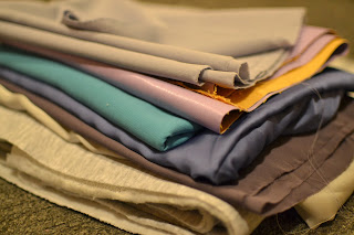
So I went to Abakhan's fabric shop, which I have never been to. It was amazing! I picked up quite a range of fabrics, some vinyl effect, thick jersey, and also some satin. I wanted a range, in texture and colour, so that I could experiment in the print room. I mainly looked for a range of greys to use as a base background. Although my fabrics are not usually what you would pair together I like the contrast between the textures.


Tonight I plan to develop some more illustrations which will suite my customer more. I am also going to look over the Photoshop 01 workshop handout to further my skills within photoshop.

Thursday 7 November 2013

Trends: Web Sights

I have been thinking a lot about who my customer is. My customer is a 20 something socialite, who enjoys being comfortable and effortless.

I have been researching into upcoming trends, and something that caught my eye was 'Web Sights'. Which linked into my project as I have been looking into using similar techniques within my work.


3.1 Phillip Lim
Derkek Lam
3.1 Phillip Lim's Resort 2014 is quite similar to the colour palette and style I have been working towards with my own collection throughout this project. Although there is no print here there is a sportswear vibe which I am really liking at the moment. I feel that sportswear is peaking at the moment within my age range and my customer has an eclectic style. Within my range I would like to have varying layers, sheer fabrics and contrasting textures, however keeping in theme with sportswear.

Seer Sucker Workshop

Seersucker is basically a technique which shrinks an area of fabric. I did not know what it was until I turned up to the workshop today, but as soon as I observed samples of the technique I really connected with the style. I feel that the technique will work hand in hand with the styling of my fabrics, as I want to use a lot of sheer fabrics and layers.

This has been one of my first workshops in the print room which I do regret this year as I am very anxious to get into the print room and start experimenting. Although I had originally planned to only use digital printing within this project I realise that not experimenting with hand printing methods would be stupid and I there could be a major oversight within the project.

My current plans to carry on with the project are to develop 2 A2 screens in the print room and spend the majority of next week in the print room, mainly experimenting with reactive dyes and the seer sucker method. Also I plan on developing my illustrations, the feedback that I got from past tutorials was that I need to concentrate more on the styling of my illustrations and the smaller details within them such as adding more definition to the hair. I agree with this as looking back at my illustrations they are rather flat and dull so this weekend I intend on developing these.

Graduate Jobs & Placement Fair

Today I went to the grad & placement fair, held in the new business school. I have been preparing for the fair by going to Careers Workshops and reading up about creative CV's. I feel a lot more confident about my cv skills after searching for these workshops off my own back rather than just being told to be in the room at a certain time. However I feel that my CV needs to be a lot more creative, I need to show  my prospective employer my style, so I have looked into a few more Careers Workshops that are relevant and will be attending those soon.

During the fair I attended 3 of the talks that took place. The Arcadia graduate talk and also the ASOS graduate & placement talks. Although I am only in my second year and went to graduate talks I felt that I wanted a clear outlook on what these companies are looking for, and thats exactly what i got. After the fair I really felt inspired to start looking for work experience and to throw myself into my work. It has made me a lot more passionate about my future.

Alice Kettle

The Transformative Power of Thread

Today we had a guest lecturer, Textiles Practitioner Alice Kettle. Alice specialises in embroidery which is not something I am overly keen on personally so I felt that the lecture was not very relevant to myself. However she did speak a lot about getting commissions and being a freelancer so it did give me an insight into a possible career path I could take in the future.

Alice takes inspiration from stories that she feels relate to her life somehow or that have thread involved within them. I find her way of finding inspiration quite interesting as I have not heard of anything like that before. Her commissions are on rather large scales such as 16 metre embroidered images. Something I did find interesting in the lecture was when she collaborated with Pushpa Kumari and they began to draw by using a single thread dipped in ink to create line. I may try to use this technique to experiment more and to see what effects I could get with this technique.


Sunday 3 November 2013

Backgrounds

After the tutorial this week I realised I needed more textured backgrounds to use along side my motifs. So on my way home from uni, there is a house in the middle of my street that has a lot of scaffolding and building work going on. On the floor outside was a bright green mesh, which I picked up and brought home as I thought it would be useful towards my work. I began to layer acrylic paint over the mesh onto plain paper. and peel away the mesh. Once peeled away I used the opposite side to print any spare paint onto the paper from the inverted side. I really like the textured look that the acrylic paint left, however I felt like the plain white background was something I had been trying to avoid, so I painted a base colour down then layered the mesh over the base colour. The effect of this has been quite successful and I plan to use these in my designs as backgrounds for my motifs to make the designs more interesting.


Something that I feel I could change is the colours, I am going to put these images into photoshop and try to colour match the painting to my colour boards. I will also try to change the opacity so the painting do not over power the designs.